


Newsweek logos and facts, 1933–2011


Source: http://www.aksenovaksenia.com.© Newsweek, December 23, 2012. License: All Rights Reserved.
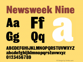
A Newsweek "By The Numbers" page chronicles some of the publication's logos from its founding in 1933 to 2011 when this graphic was published.
If you know any of the designers or histories behind these Newsweek logos, please post a comment. Here's what I've gathered so far, with the gracious help of frequent Newsweek logo designer JIm Parkinson:
The 1986 logo (see also below) was Egiziano that ended up in Black's New West magazine design.
A logo that is missing from the image above is a refinement that Parkinson did sometime after Amid Capici took the creative helm in 1995 (see below). The most significant changes were made to the 'w' and 'k', and the counters were opened up overall.
In March 2011, Parkinson created a new logo based onTitling Gothicfor a Dirk Barnett redesign. (Titling Gothic is also used for the numbers and captions on the right half of the page above.)
In March 2014, the magazine returned to print and brought slab serifs back to the logo, mixing elements from its past.
The compilation image above also omits what has been a signature of the logo since the 1986 redesign: the red box. Parkinson recalls:
"Putting the logo in a red box was Roger's idea. Newsweek was a news magazine and you could never tell what the cover art was going to be or how it would interact with the logo. As I remember, each week, the art department made three covers. A photo cover, a type cover and an illustration cover. Whichever one they picked was often trumped by breaking news which came with a news photo that usually disrupted the whole idea of 'design' and buried the logo. The red box isolated the logo so nothing could interfere with it."

Image courtesy Jim Parkinson. License: All Rights Reserved.
Circa 1996 logo by Jim Parkinson Amid Capici.

Image courtesy Jim Parkinson. License: All Rights Reserved.
1986 logo by Jim Parkinson for Roger Black.


 闽公网安备35010202000240号