


Ad for Fritz Wortmann's "Friwo-Gold" fountain pens


Source: https://www.flickr.com.Uploaded to Flickr by altpapiersammler and tagged with "phosphor", "energos", "deutschmeister" and "futura". License: All Rights Reserved.
The umlaut dots in Lichte Fette Grotesk are integrated into the cap height.
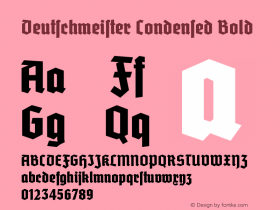
This German advertising leaflet from the late 1930s shows a wild and unsophisticated mix of typefaces. The sans-serif inline in all caps for 'Goldfüllfederhalter' (golden fountain pens) is Jakob Erbar's Lichte Fette Grotesk (c. 1923), better known asPhosphor. Note the compact umlaut and the use of its two different forms for 'R'. The heavy script isEnergos(1932).
The text serif is the oldest typeface in this smorgasbord: It isAugenheil-Antiqua(with Augenheil-Kursiv), designed by Richard Ludwig, son of foundry owner Carl Jacob Ludwig, and released in 1907 by Ludwig & Mayer [Reichardt]. The name of this idiosyncratic typeface, Augenheil, translates to something like "eye cure".Futurafett (1928) is used for emphasis — in addition to other means like arrangement, indentation, borders, manicules and letterspacing.
Interestingly, the most recent typeface here is the only blackletter style: It isDeutschmeisterschmalfett (1934), a simplified Gotisch in the vein of Element, National or Potsdam. Blackletter was not commonly used for commercial purposes. Only in the mid-1930s, after the Machtergreifung, it had a comeback in this segment, fueled by the release of a number of modernized and striking display faces.

Source: https://www.flickr.com.Uploaded to Flickr by altpapiersammler and tagged with "phosphor", "energos", "deutschmeister" and "futura". License: All Rights Reserved.
Note the use of the ligatures 'ch' in Futura and 'ſt' in Deutschmeister, which are maintained even with increased letterspacing.


 闽公网安备35010202000240号