


Borges. A Reader by Emir Rodriguez Monegal & Alastair Reid (Ed.)

导语License: All Rights Reserved.The designer did some interesting re


License: All Rights Reserved.
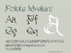
The designer did some interesting redrawing on this title. Besides the big new descender on the g, she redrew the s and linked it to e. She also changed the rounded ear on g to more of a flag, to match what she did on s.
She didn't stop there. In the bottom two credit lines, the x-height of which is about 16 points, she kept that new ear on g, changed the dots on the i's to diamonds, and added a swash to A. I'm not sure if the ampersand is entirely new, or was an available alternate.
Let's remember that this was all drawn by hand! Often, drawn lettering from the pre-digital days will show rough outlines, but this is very smooth.

相关字体家族


Borges. A Reader by Emir Rodriguez Monegal & Alastair Reid (Ed.) 网友点评
Borges. A Reader by Emir Rodriguez Monegal & Alastair Reid (Ed.) 最新评论
暂无相关评论


推荐字体资讯

 闽公网安备35010202000240号