


Parry Shines On Two Birds Press Sketchbook


Late last summer I discovered a very nice application of Artur Schmal's Parry, the sans/serif type family released through the reputable Belgian foundry OurType. It was used for the Two Birds Press sketchbook featured on FPO – For Print Only, the five months old blog by Under Consideration's Bryony Gomez-Palacio and Armin Vit. Just like Brand New, their great blog "displaying opinions, and focusing solely on corporate and brand identity work", this still relatively young venture features highly specialised content. On FPO the authors "celebrate the reality that print is not dead by showcasing the most compelling printed projects".

The About page teaches us that "FPO is a blog dedicated to both the visual stimulus and the detailing of the development and production of printed matter: annual reports, books, business cards, stationery suites, collateral materials, posters, packaging and anything else where ink meets substrate". What sets FPO apart from similar design blogs is that it does more than just show well-produced and beautifully designed print objects. Besides descriptions and commentary, each spotlighted project comes with full production details, down to minutiae like colours and varnishes, production time and cost, and type credits. As Bryony and Armin explain in their introductory post:
(…) we are attempting to bring to the fore the details behind the luscious projects. In other words, adding some meat and veggies to the feasting candy, as part of a nutritious new design blog.
This makes the website extra valuable, not only for professionals – both graphic designers and clients – but especially for students because it makes the practicalities of graphic design work tangible. No need to stress I highly recommend bookmarking FPO and adding the RSS feed. And although the authors do scour the web on their own to find interesting projects around the world, they gladly accept submissions from their readers.

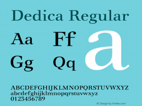
Now back to that lovely Two Birds Press sketchbook. It was designed by Emu Design Studio's James Boborci, and printed and produced by Yorke Printe Shoppe. Boborci told me they wanted to design a sketchbook that addressed many of the shortcomings they noticed in other sketchbooks… comfortable yet portable size, places to keep found items, good quality paper, and an interesting but understated design. Since the project consists of mainly blank sketching pages, choosing the right typeface was critical. In order to communicate in an engaging and effective manner, they needed a typeface that was crisp and legible while at the same time had a strong presence and a distinct personality. Parry fit perfectly; sturdy and well formed, it remains legible and eye-catching no matter the size or surroundings.


Emu used the heavier weights for the most part, which – especially in italics – are absolutely gorgeous. What really drew Boborci to Parry however are its quirks. Unlike other slab-serifs with severe geometric angles, many of Parry's letterforms have slightly convex serifs that give it an endearing and approachable quality. He thinks that Parry simply embodies the same characteristics he wanted the finished project to have: an easy and understated elegance.


 闽公网安备35010202000240号