


Burdick Brewery


Source: http://burdickbrewery.com.Burdick Brewery. License: All Rights Reserved.
The website of Seattle-based beer aficionadosAkkurat Monoand Monokrom'sTelefon.
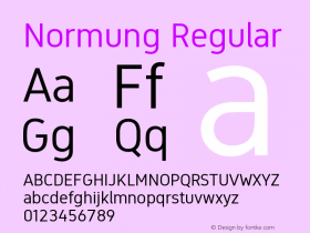
Telefon (2012) is rooted in the beginning–to-middle of the 20th century. The designer, Sindre Bremnes, casually dates it to the years separating World Wars I and II. Its letterforms are drawn with machine-inspired geometry, the kind of shapes that suddenly became so natural to produce following the Industrial Revolution, shapes Renner and the Bauhaus students would refine in the 1920s (though perhaps more for philosophical reasons, than ease of construction), shapes that would tend towards ornamental in Art Deco, and later still, form the basis for a surge of uninspired dime-a-dozen sans serifs in the early 21st century.
Separated from the heydays of the triangle-square-circle geometric sans by Hitler's gruesome Third Reich, it is perhaps no wonder the Modernists looked elsewhere for inspiration. The Neo-Grotesques, of which Helvetica is arguably the most successful, is modeled on some of the earliest sans serifs that cropped up in the early 1800s, the Grotesques. The Neo-Grotesques discards all the funkyness of the early sans serifs in exchange for contrastless ur-letters, with strokes terminated at 90 degrees – neutral and strict.
Laurenz Brunner's Akkurat, released in 2004, is a contemporary take on the Swiss Modernist sans serif. The only common ground it shares with Telefon, is the reference to the German traffic alphabet defined by the German standards body DIN – Deutsches Institut für Normung – in 1931. Where Akkurat borrows it straight sides, Telefon borrows its details.
It is common designer knowledge that a pair of typefaces should have enough contrast to clearly discern one from another. Hence, the most common combination is usually a sans and a serif. I can't help thinking the Burdick Brewery designers must have taken Norman Fairclough's Language and power, in which he argues that anything "common sense" must be questioned, to heart.
The strangest of pairs, Telefon and Akkurat – balancing on the edge of failure. Their relationship hinges on their subtle common heritage, the weight difference, and the fact that one is monospaced while the other is proportional. I guess what I'm saying is, this is surprisingly clever. Even for a hipster.

Source: http://burdickbrewery.com.Burdick Brewery. License: All Rights Reserved.

Source: http://burdickbrewery.com.Burdick Brewery. License: All Rights Reserved.

Source: http://burdickbrewery.com.Burdick Brewery. License: All Rights Reserved.

Source: http://burdickbrewery.com.Burdick Brewery. License: All Rights Reserved.

Source: http://burdickbrewery.com.Burdick Brewery. License: All Rights Reserved.
The Burdick Brewery logotype is a modfied Telefon.


 闽公网安备35010202000240号