


Skiforbundet.no


Source: http://www.skiforbundet.no.License: All Rights Reserved.
Netlife Research's new website for the Norwegian Skiing Association,Telefon– an amalgamation of Norwegian typographic culture from the Interbellum years through-out the 20th century – as the leading voice for the visual profile ties the traditional and the contemporary nicely together.
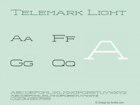
Be it cross-country through endless woods and over frozen lakes, downhill Telemark style, or daredevil ski jumping contests as first held in Trysil back in 1862 – skiing is quintessentially Norwegian. Strapping on a pair of skies on a clear winter's day in the Nordmarka slopes surrounding Oslo, you are just as likely to meet king Harald V, as your nextdoor neighbour.
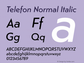
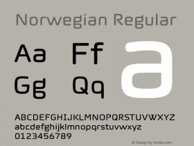
Matthew Carter's screen-optimized serifGeorgiacarries the main bulk of text, while Sindre Bremnes' Telefon is used for navigation, headers and tables, both hand-hinted for clear rendering when few pixels are available to draw the letterforms.
The website scales comfortably to small screens. For handheld devices, the navigation is hidden beneath the now commonplace hamburger menu symbol, and on desktop computers it snaps to the left edge, leaving plenty of room for the imagery to shine.

Source: http://www.skiforbundet.no.License: All Rights Reserved.

Source: http://www.skiforbundet.no.License: All Rights Reserved.

Source: http://www.skiforbundet.no.License: All Rights Reserved.

Source: http://www.skiforbundet.no.License: All Rights Reserved.

Source: http://www.skiforbundet.no.License: All Rights Reserved.


 闽公网安备35010202000240号