


Utopia 2516


Source: http://jacqueline-dietz.de.Jacqueline Dietz. License: All Rights Reserved.
In 1516 – at the peak of the Renaissance – the English lawyer, social philosopher, author and statesman Thomas More released a book called De Optimo Reipublicae Statu deque Nova Insula Utopia. The Latin title translates to "Of a republic's best state and of the new island Utopia" and tells the story of a complex, self-contained world set on an island, in which communities shared a common culture and way of life, eliminating social conflict and distress. There were few laws – and no laywers. Property and wealth were evenly shared among the population, and every aspect of life heavily regulated from cradle to grave.
Combining the Greek words ou (οὐ), "not", and topos (τόπος), "place", the term "Utopia" has come to mean a perfect, yet perhaps ultimately unreachable, place. Although the book is considered a critique of the state of England at the time, the ideas put forward by More have been instrumental in shaping modern political socialism. His theories and principles apply even today, but at the same time arouse an uneasiness and fear of total surveillance and total control of citizens by the state.
Jacqueline Dietz's semester project at Hochschule für Technik und Wirtschaft revives More's now 500 year old book in an ingenious way. By the simple addition of the year 2516 to the title, Dietz places the book 500 years in the future. Combined with her original illustrations, the fictional work of Utopia has suddenly become science fiction.
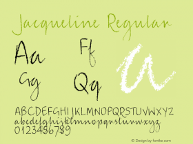
Typesetting the book in Sindre Bremnes' debut typeface is an equally genius move.Satyrbuilds upon the shapes of the early humanist antiquas, which first saw light during the Renessaince – the very same period in which More wrote his book. Still, Satyr is no mere emulation of analogue tools. The letterforms are crafted independently of the broad-nib pen, almost as if the designer is shaping a boat or a viola, juxtaposing concave and convex curves to create a simultaneosly dark and airy textface. Satyr lends as much from the past, as it looks beyond now and towards the future. Breaking free from convention, its letters seems to change their mind midway through strokes, distributing weight in unusual places. With axe-like terminals and accentuated corners, Satyr creates a lively texture, just tempered enough as to not overshine the content.
The execution is topped off with Dietz' custom-drawn initials, based on Satyr and matching in style to her illustrations. The book is cloth-bound with tactile three-dimensional white letters and, in urgent, alarmingly red – just like its endpapers – the numerals 2 5 1 6.

Source: http://jacqueline-dietz.de.Jacqueline Dietz. License: All Rights Reserved.

Source: http://jacqueline-dietz.de.Jacqueline Dietz. License: All Rights Reserved.

Source: http://jacqueline-dietz.de.Jacqueline Dietz. License: All Rights Reserved.

Source: http://jacqueline-dietz.de.Jacqueline Dietz. License: All Rights Reserved.

Source: http://jacqueline-dietz.de.Jacqueline Dietz. License: All Rights Reserved.

Source: http://jacqueline-dietz.de.Jacqueline Dietz. License: All Rights Reserved.

Source: http://jacqueline-dietz.de.Jacqueline Dietz. License: All Rights Reserved.

Source: http://jacqueline-dietz.de.Jacqueline Dietz. License: All Rights Reserved.


 闽公网安备35010202000240号