


Quitador: A Different Kind of Slab Serif

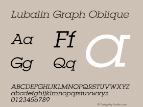
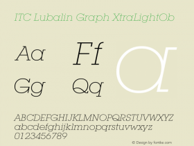
"Broadly speaking, you can divide slab serifs typefaces into two groups," says Arne Freytag, the designer of the new Quitador™ family. "They either tend to be have geometric proportions and monoline strokes, like those in ITC Lubalin Graph™, or are more humanist leaning, like the Caecilia® family."

"A strict classifying of Quitador is difficult," He continues. "I pursued my own interpretation of square serif designs, to develop a family that is somewhere between pure geometric and humanistic styles." While there are subtle traces of humanistic character traits in the roman designs, it is in the italics that they become more prominent. The not quite closed bowls in characters like the a, b, g and p, in addition to the open shoulders of the m, n and u, soften the roman letterforms. This is also true for the italic designs, but here characters like the single-story a, cursive f, and sprinkling of curved base-serifs, create a much stronger humanistic statement.
"I pursued my own interpretation of square serif designs, to develop a family that is somewhere between pure geometric and humanistic styles."
Although you would not know it from the completed designs, Freytag struggled with the very bold weights. "They quickly became quite compacted and dark," he says. "it was also important to leave adequate white space between the serifs of adjacent characters. For example, when I compared setting cap H's and O's there were huge differences in character spacing. You can't solve this problem without modifying the thickness or width of the serifs." This was a time consuming process for Freytag. He did not want to try to plan for all eventualities – but let them arise as part of the design process. The result is particularly even typographic "color" in even the boldest of weights.

The Quitador family is comprised of 14 typefaces – 7 weights from Ultra Light to Ultra Bold, each with an italic complement. The designs are available as only $99/€99.
Interested in using the Quitador collection on the Web? The family is available for use though all Fonts.com Web Fonts paid subscription plans too.


 闽公网安备35010202000240号