


Albertsons logo and signs


Source: https://www.flickr.com.Jeffrey S. on Flickr. License: All Rights Reserved.
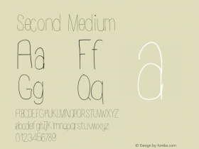
Introspect,with some minor adjustments and rounded corners. Albertsons was founded way back in 1939, but they must have adopted Introspect sometime in the early '80s. (Here's what an Albertson's sign looked like in 1959 and 1978.)
Over the years — perhaps due to repeated tracing over photocopied originals — it seems that the official wordmark has gotten increasingly soft and mishapen, the letters like gummy bears left to melt in the hot sun. Maybe they should get a copy of URW's digital version of the font and start over.
Introspect's designer Phil Martin, had this to say about Introspect in his 2004 e-book Design for (a) Living:
Which leads me to my Introspect series, probably my second best.
I had this crazy idea, can I design a face where some of the lowercase letters touch themselves in places where they are not supposed to? A colleague said, "If you can do that you might want to name it 'Bad Printing.' That's what happens in bad printing, you know."
I stuck with my idea and released Introspect in 1971.
In some way that no one will ever be able to explain, the design said "food product" to package designers. I soon came to call it my supermarket face. I rarely walked down the isle of a supermarket without some package on one side or the other, flashing its product with the name set in my Introspect.
"Buy me and eat me," spoke Introspect throughout the food stores of America and beyond. Fulfilling for a designer, don't you agree?
Even today the Albertson chain of supermarkets and liquor stores carry their logo and other copy in a slightly modified version of Introspect.

Source: http://idahobusinessreview.com.Patrick Sweeney, Idaho Business Review. License: All Rights Reserved.

© Albertsons LLC. License: All Rights Reserved.

Source: https://www.facebook.com.© Albertsons LLC. License: All Rights Reserved.

Source: https://www.flickr.com."Navymailman" on Flickr. License: All Rights Reserved.


 闽公网安备35010202000240号