


Global, Local, Social: ATypI Barcelona 2014 (Part 2)


With Typographic Dialogues, the theme of their 58th conference, ATypI (Association Typographique Internationale) invited type and design aficionados from all over the world to Barcelona. The presentations on day 2 concentrated primarily on education. While in part 1 of my review you can discover some of the more technical talks given at BAU Design School Barcelona, focusing on interpolation tools, we now switch to all kinds of typography teaching methods.
Day 2: educational advice and lots of learnings: by lettering, letterpress dialogues, legibility studies – and looking for roots
Again I strongly recommend to take a look at the ATYpI presentations programme for an overview and pointers for further exploration, because I only share personal highlights in these reports. The second day at BAU Design School Barcelona was predominated by explorations about how to teach type and typography, and more specifically how to teach letter drawing.
Dan Reynolds tried out 10 methods. Among them were drawing by pen and in Illustrator, stencil making (which he finds an "excellent method"), or just walking around and taking pictures of type you like, than work with those (and other) photographic resources. This turned out to be most effective for his students, but Dan still would be open for a method 11 or 12, "if they work".
One, two three: draw fast!
Sofie Beier applied legibility studies to find out how to design type that works (you may know the stunningly effective bouba/kiki effect). And Martina Flor uses a trick: "Teaching lettering is a friendlier way of saying 'I teach type design'". She encourages her students to explore, as "the more extreme you go, the more problems you have" – and the more interesting it becomes. Martina considers it essential to teach the tools first, then to teach the design process, and eventually practice a lot. "Draw fast, and as much as possible"! We should not stick to a layout (or any idea) for too long, says Martina, because this makes it harder to detach ourselves from it, change it, and improve it.

Martina Flor offered valuable insights in how to teach people type (via lettering) – and how to get things done in general.
In his lecture Looking for roots Domen Fras illustrated how difficult it is to teach type when on the one hand students are interested and motivated, yet on the other hand almost no teaching structures exist, in his particular case in Slovene. He mentioned the lack of historical sources and the lack of fonts that support the functional aspects of the Slovene (and other) language systems. He described the only four existing books on typography in his mother tongue and the Tipo Brda workshops at University of Ljubljana, being the first of their kind in Slovenia. (For German readers: Filip Blažek, Petra Černe Oven and Veronika Burian spoke about intercultural aspects of type design and usage at the Raabs conference in Austria – read more in my Bericht aus Raabs.)
Domen's presentation made us aware of how privileged we are, if you are living in a city like Berlin for example, with its high density of type designers, several universities with design and communications curriculums, lettering workshops, meetings points, and a huge conference… The same applies to Great Britain. Rose Gridneff, Alexander Cooper and Andrew Haslam presented the 6×6: Collaborative Letterpress Dialogues teaching project to which six design schools in UK contributed. They explained in minute detail and very academically the links between contemporary and historical letterpress work, providing theoretical background and pointing out political implications as well.
France: an eventful history and generous funding
A proper follow-up is Thomas Huot-Marchand who speaks about the (almost non-existing) history of French typography. This encompasses a lot of learning, many drawbacks and new starts, including several revivals of the ANRT (Atelier National de Recherche Typographique). As its current director Thomas Huot-Marchand does his best to have the ANRT playing a stabilizing role in the state of typography in France and making a strong impact, with a focus on research and interdisciplinary partnerships.
The ANRT prefers to support complex, long-term projects. Among them is the digitization of the typeface for the Französisches Ethymologisches Wörterbuch by Walther von Wartburg. If I understood it correctly, it contains at least three diacritical marks that have never before been combined in one font. This is the PHD project of Sarah Kremer; another one would be Sébastien Biniek's research of the type systems used for cartographic visualizations. He explores textual hierarchies and lettering in large-scale maps and the gap between the archetype and the actual letter forms in the context of their composition.
The ANRT in Nancy, France grants funding for two projects per year, which they propose themselves, and are also open for one application with a topic suggested to them. In either case the support is really generous, so students with good ideas and long-lasting intentions in type should feel encouraged to submit their project! You can find the current (2013/14) student projects supported by the ANRT and all the information required for applications on their website.
Research, live on stage
Each and every day in Barcelona made a lot of impact – the lectures were packed with information and the ATypI programme packed with excellent lectures. Jesús Barrientos from Mexico discussed the fact that "nomenclatures can be very different from country to country". For example the expression "gótico" in Spanish countries means something else than what native English speakers or German designers refer to when they use the words "Gothic" or "gotisch" in the field of typography. Next lesson learned!
Kevin Larson – a researcher on Microsoft's Advanced Reading Technologies team – actively engaged with the audience during his presentation. Instead of simply presenting certain theories or stating new ones, he asked questions that we tried to answer, but not always succeeded in doing so. Not only did he leave them open as well, in some cases he had no answers himself, forcing us to come up with our own solutions. Using this fun presentation technique, Kevin gave a live demo of what research is like. He made us realize how many theories or rules are very much in transition, even if they initially seem to be straightforward and self-evident, like punctuation in this specific case. Where in the following test sentence would you put a comma, and how many would you use in total? "The only people I have ever met who believed their ears were blind". It was no wonder that this was followed by a heated discussion amongst the audience with a lot of new questions, and eventually a birthday song. Congratulations Kevin! You made us think.
Ann Bessemans collaborated with Kevin Larson on her legibility research and contributed to TYPO Berlin 2013 Touch by presenting her research-based font Matilda. She did her PhD dissertation on Type Design for Children with Low Vision under the supervision of Prof. Gerard Unger (Leiden University) and Prof. Dr. Bert Willems (Hasselt University). She researched how people, specifically children, read type and grasp content? In which ways can this be influenced by the design and choice of typefaces? Ann Bessemans added the aspect of rhythm to the lively debates we had in Barcelona. Please read Ralf Herrmann's article on her findings when working with children with low vision.
Vehement tempers
Michele Patané runs his studio Cinetype in London and works for Dalton Maag. One of his tasks is bridging the academic world and the industry via employee training programs. He does so with charming Italian flair and champions freedom of experimentation, because "the mindset is more important than the tool". How true…
On the evening of the second day we were treated to a powerful opening keynote in the Museu del Disseny in Barcelona. Raquel Pelta spoke (in vibrant Spanish) about Graphic design and typography for social change. She is a professor at the department of fine arts of Barcelona University and co-editor of Monográfica magazine. She holds degrees in geography, history and audiovisual communications, with an emphasis on the cultural implications of design and typography.

Raquel Pelta displaying strong statements live on stage and on posters. This one says: "We were children of comfort but we will not be parents of conformism".
Pelta explained how type design helps to spread the rights ("ayuda difundir los derechos") of citizens and are a prerequiqite for the freedom of press ("la libertad de la prensa"), as well as a means of transmitting concepts ("medio de transmisión de ideas"). She backed up her statements with a well-selected range of posters, art installations, and subversive fonts. Probably the most impressive poster was one displaying the letters "S PAIN". The letters seem to literally embody the hardship our Spanish colleagues (and their whole country) have to bear. Pelta, in her forceful way of speaking, was not shy to admit that "esta situación nos hace un enorme dolor" – in no need of translation.

Painfully descriptive.
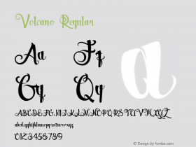
Among the socially subversive typefaces shown by Raquel Pelta were Prozac and the Doctrine family by Jonathan Barnbrook (Virus Fonts), and the gruesome Genocide "font" by Lars Harmsen (Volcano Type), who used pictures of war and torture victims from our collective consciousness. Please check it out, there is so much worth discovering.
An unrepenting NO
Another impressive character awaited us the next morning. Day 3 started off with Michael Twyman, who followed José Scaglione's and Andreu Balius' welcoming address. Michael Twyman, Professor Emeritus of the Department of Typography & Graphic Communication at Reading University, referred to a presentation he gave in 1970. Back then he had to explain the concept of the first typography course ever introduced at Reading…

It is probable none of the younger ATypI attendees knew who this hippie, visiting the letterpress shop at Reading University in the early 70s, was.
One of the early visitors of the course was a young blonde hippie who had just started printing at the University's letterpress workshop. Twyman wondered "who in the audience under the age of 30 can identify this young man"? Well, it was the notorious Erik Spiekermann who could not attend this year's ATypI but sent a poster he had printed in his very own letterpress gallery which he runs in Berlin since a few months. It was rolled out on stage and read "You cannot not communicate".

Erik Spiekermann could not attend the conference, but sent those self-printed greetings from Berlin: "You cannot not communicate".
Coming back to our topic, Michael Twyman wondered why teaching often results in desaster. Possibly Dan Reynolds and some other speakers of the first conference day in Barcelona may have agreed. 50 years after that other lecture, in the current digital era and radically changed society, education and type design, Michael Twyman wonders whether typographic education is or should be different. Probably not. Twyman still favours encouraging future generations to explore the products of the past. He has an open mind and picks up on the ideas of design thinking and the importance of looking at user experiences, nevertheless referring to letterpress and other artifacts as the most useful interface. So, did his convictions change over the past 50 years? His answer came as no surprise: "an unrepenting NO" (it sounded as if it simply had to be written in capitals).
During the Q&A art historian Marianne Unger-de Boer asked another one of those essential questions: "Does the content of a text influence the typography?" Twyman replied: "Undoubtedly! And not only the content, but the underlying spirit of the text", which prompted another member of the audience to wonder whether he feels when he understands this underlying spirit of a text. AT first Twyman seems to not grasp the meaning of the question, then replies with an infectuous relief: "Well, I do when designing my own text. With other texts you never know…"
Yes, you never know.
Still to be continued! In part 3 of this review I will try and sum up the rest of the conference days (not an easy feat, believe me) and give an overview. And in case you missed it: you can find Part 1 here.


 闽公网安备35010202000240号