


Future Exhibitions Nº 1


Source: http://konstochteknik.se.© Konst & Teknik 2009. License: All Rights Reserved.
The art world and the type world have a lot in common. As we move into the future some of the traditional methods and models of creation, participation, and control have grown stale.
In 2008 FontShop andBall and Chain, a connect-the-dots face by the prolific Wilson Thomas a.k.a. funk_king, paired with an article on the networked age and engaging the audience.
•Wee the People, also by Thomas, a typeface constructed of human icons on the topic of a human-centric exhibit.
• Jade Gordon'sBolts, a nuts-and-bolts collection in a chapter about technology.
• The dottedPullchainby David Sudweeks, in reference to a world without borders.
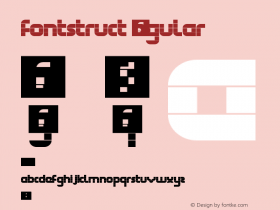
•font4by webviking6, a FontStruction made from shaded bricks in an interview with a modular architect.
• The shaded squaresLast Brickfrom Alex Fulton where artists discuss "deserting the white cube."
•Avantesk, a reconstruction of Avant Garde by Tiago Balas a.k.a. eskema paired with illustrations depicting Edvard Munch works.
• The Tetris-inspiredTetrisydeby Gene Buban on the topic of blurred borders.
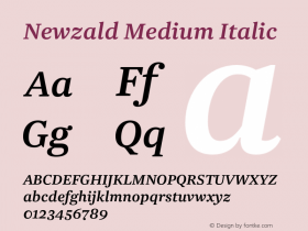
Having installed all these fonts in preparing this article, I can attest to their low quality. Luckily, InDesign offers enough control for a skilled typographer to set it right. An economic solution to dynamic drop caps and punchy pull-quotes. However, Konst & Teknik don't rely on questionable free fonts to do the heavy lifting. The form is built on Riksutställningar'sAkzidenz-Grotesk(in captions and pull-quotes) as a guiding force. To accompany Akizdenz, all body copy is gracefully set inNewzald, using two grades to demarcate Swedish and English text.
Trim Poster. Patch was among our Contributors of the Year 2013. This is his second appearance on the Fonts In Use Blog.

Source: http://konstochteknik.se.© Konst & Teknik 2009. License: All Rights Reserved.
Table of contents.

Source: http://konstochteknik.se.© Konst & Teknik 2009. License: All Rights Reserved.
The large quotes are inTemptationby Karolina Lach a.k.a. sliveress.

Source: http://konstochteknik.se.© Konst & Teknik 2009. License: All Rights Reserved.
The electric bottom-heavy caps are fromFairy Feller's Master Stroke, a design by Wilson Thomas.

Source: http://konstochteknik.se.© Konst & Teknik 2009. License: All Rights Reserved.
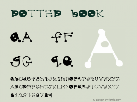
Round Pixelis the debut of FontStruct user sora005.

Source: http://konstochteknik.se.© Konst & Teknik 2009. License: All Rights Reserved.
The dottedPullchainby David Sudweeks, in reference to a world without borders.

Source: http://konstochteknik.se.© Konst & Teknik 2009. License: All Rights Reserved.
The shaded squares ofLast Brickfrom Alex Fulton where artists discuss "deserting the white cube."

Source: http://konstochteknik.se.© Konst & Teknik 2009. License: All Rights Reserved.
Anchorageby Ben Hamm, a FontStruction inspired by the signage of a fish house in Alaska.

Source: http://konstochteknik.se.© Konst & Teknik 2009. License: All Rights Reserved.
Reversed caps fromBlackwolfby Axel Leyer.

Source: http://konstochteknik.se.© Konst & Teknik 2009. License: All Rights Reserved.
Avanteskby Tiago Balas, a reconstruction of Avant Garde paired with illustrations depicting Edvard Munch works.

Source: http://konstochteknik.se.© Konst & Teknik 2009. License: All Rights Reserved.
The Tetris-inspiredTetrisydeby Gene Buban on the topic of blurred borders.


 闽公网安备35010202000240号