


Civic City Cahier series


Source: http://www.bedfordpress.org.License: All Rights Reserved.
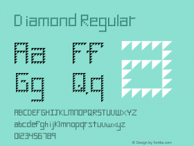
Times. Civic City Cahier 2 not only introduces a different color, but also a number of slight — almost inconspicuous — modifications to the typeface: the 'i' dot is enlarged and diamond-shaped, the diagonals of 'w' overlap, 'W' has a low center vertex, 'A' gets a bent crossbar (as one can find in Romanesque inscriptions). Issue 3 picks up from there and adds several stencil-like letterforms. The typographical metamorphosis continues: For issue 4, ubiquituous Times has been turned into an odd hybrid with Latin (i.e. triangular) serifs. Civic City Cahier 5 interrupts the linear degradation and returns to the third stage, but not without implanting a new typographical interference: 'wy' is merged into an unignorable ligature. The last issue from September 2013 resumes the triangular serifs and throws in a 'z' with crossbar as well as an alien ampersand.

Source: http://www.bedfordpress.org.License: All Rights Reserved.
The type modification for Civic City Cahier 2 was provided by Milieu Grotesque.

Source: http://www.bedfordpress.org.License: All Rights Reserved.
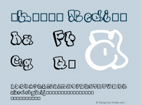
The counters were opened by Charalampos Lazos of Last Minute Panic.

Source: http://www.bedfordpress.org.License: All Rights Reserved.
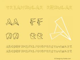
Studio Tobias Becker takes credit for the "Latinization" of the serifs. On their website, there are character set showings of "Axe Times".

Source: http://www.bedfordpress.org.License: All Rights Reserved.
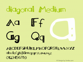
The type modding for the fifth issue is ascribed to Laqshmi Manolete Pellegrin.

Source: http://www.bedfordpress.org.License: All Rights Reserved.


 闽公网安备35010202000240号