


Rimi Norway


Source: http://rimi.no.Rimi. License: All Rights Reserved.
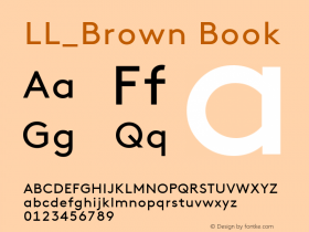
viaCampton, designed by René Bieder and released in February 2014. Campton follows in the footsteps of Aurèle Sack's popular LL Brown: It is a geometric sans-serif in which counters of 'a', 'g' etc. are not round, and arcs in 'h' or 'm' don't flow smoothly into the stems. It has round dots, too. The caps are wider and less tall than in LL Brown, which gives it a chubbier look. Campton itself made it onto MyFonts'FS Sammy(2009), a rarely seen script that emulates chalk writing, designed by Jason Smith and Sammy Satwinder for Fontsmith.

Source: http://rimi.no.Rimi. License: All Rights Reserved.

Source: http://rimi.no.Rimi. License: All Rights Reserved.

Source: http://rimi.no.Rimi. License: All Rights Reserved.

Source: http://rimi.no.Rimi. License: All Rights Reserved.

Source: http://rimi.no.Rimi. License: All Rights Reserved.


 闽公网安备35010202000240号