


Stevie Wonder website


Source: http://www.steviewonder.net.Stevie Wonder 2015. License: All Rights Reserved.
Homepage
via Lust Scripttheoretically is a fine choice, but the website designers paid no heed to Neil Summerour's explicit warning:
I cannot stress this enough. Please know what you are getting into with this typeface. Like a supermodel, it can't be squeezed into every situation. It needs room and size to breathe. The regular weights can support 36-point or higher settings, whereas the display weights shine above 72-point (preferably 100-point).
Retina screen or not, 18px and less is not enough for Lust Script to shine. Not to mention the readability disaster that is the tiny narrow reversed Alternate Gothic as used for the news, sometimes in all caps, sometimes with fake italics. Successful typography doesn't end with picking a nice typeface. On the contrary, that's but one step, and not necessarily the first.

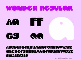
Source: http://www.steviewonder.net.Stevie Wonder 2015. License: All Rights Reserved.
Detail

Source: http://www.steviewonder.net.Stevie Wonder 2015. License: All Rights Reserved.
Detail

Source: http://www.steviewonder.net.Stevie Wonder 2015. License: All Rights Reserved.
Detail

Source: http://www.steviewonder.net.Stevie Wonder 2015. License: All Rights Reserved.

Source: http://www.steviewonder.net.Stevie Wonder 2015. License: All Rights Reserved.


 闽公网安备35010202000240号