


Racko (Rack-o), Ravensburger edition

导语Source: http://boardgamegeek.com.License: All Rights Reserved.Lik


Source: http://boardgamegeek.com.License: All Rights Reserved.
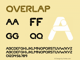
Like the similar Gaston/Charade,Candiceoften looks better when the letters are connected, as proven in this logo for Racko (the German version of the popular American card game Rack-o). It makes one wonder if the original Letraset version was meant to have overlapped spacing and the makers of the digital fonts mistakenly added unnecessary space between the letters.

Source: http://boardgamegeek.com.License: All Rights Reserved.

Source: http://boardgamegeek.com.License: All Rights Reserved.

相关字体家族


Racko (Rack-o), Ravensburger edition 网友点评
Racko (Rack-o), Ravensburger edition 最新评论
暂无相关评论


推荐字体资讯

 闽公网安备35010202000240号