


Dynamo youth center building and logo


Source: https://twitter.com.License: All Rights Reserved.
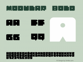
Official logo (as of 2015).
"The cultural youth centreITC Pioneer. The typeface's shadow is gone and some strokes and widths modified, but otherwise it's quite felicitous how nicely the modularity of Pioneer matches the grid of the façade segments, with its angles echoed in the faceting. The letters with strokes that extend beyond the baseline and capline ('Y, N, A, M') are not found in the digital version of ITC Pioneer, but Shaft.
The official logo for the Dynamo center is less … dynamic, omitting the swash extensions so the word fits in a flat rectangle. Corners were also softened in the mark.
The logo appearing on the building dates back to at least 1988 (see the flyer below for the Open Air festival of '88). The Dynamo rock club was founded in 1981 and the Open Air heavy metal festival was launched in 1986 to celebrate their fifth anniversary. It's clear that the logo was inspired by the aesthetic of metal band logos like Iron Maiden, Metallica, and Megadeth.

Source: https://commons.wikimedia.org.Photo by Rosemoon on Wikimedia Commons. License: CC BY-NC-SA.
The word is not quite as legible with the sun hits it directly from above.

Source: https://twitter.com.Photo by Rafaël Rozendaal. License: All Rights Reserved.

Source: http://www.diederendirrix.nl.Photo by Arthur Bagen. License: All Rights Reserved.

Source: https://twitter.com.Photo by Artur Schmal. License: All Rights Reserved.
Dynamo Open Air '88. Looks like they stretched the thing out a bit here, but the tapering cut in the 'M' works better than the simple line in the other logo version above.

Source: http://www.pepalaje.nl.License: All Rights Reserved.
Original Dynamo logo.


 闽公网安备35010202000240号