


Eileen Fisher logo


Source: https://www.facebook.com.License: All Rights Reserved.
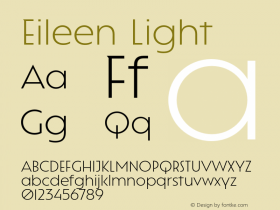
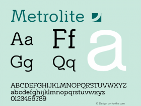
The mark for women's clothing label Eileen Fisher is set in a slighly condensed MetroLite fromMetro No. 2, which is very representative of the brand's design: understated, spare, light, modern with a touch of humanism. I do question the spacing, however: someone felt the need to vertically align the 'L' with the 'S', yet the 'E' not quite with the 'H', ignoring the large space created between 'L' and 'E' in the first line. Once you read "EIL EEN", you cannot unread it.

Source: http://www.eileenfisher.com.License: All Rights Reserved.

Source: http://www.sergiokurhajec.com.License: All Rights Reserved.

Source: http://www.sergiokurhajec.com.License: All Rights Reserved.

Source: http://www.manrepeller.com.License: All Rights Reserved.


 闽公网安备35010202000240号