


Ellington Hotel Berlin


Source: http://www.ellington-hotel.com.License: All Rights Reserved.
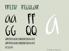
On first sight, these ultra condensed letterforms of equal height resemble Barcode, but with lowercase forms. With that enlongated loop of 'g', the logo is also reminiscent of an — imaginary — contrastless unicase variant of Empire. The overall look has a Neville Brody ring to it, see e.g. his FF Dome. One can get pretty close with the condensed styles of Flat-it's twin families Rama Gothic ('e', 'o') and Dharma Gothic ('t').
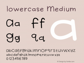
It's the sassy ear of 'g' which reveals that this logo actually is a modifiedKnockoutNo. 26 Junior Flyweight.

Photo: Florian Hardwig. License: CC BY-NC-SA.

Photo: Florian Hardwig. License: CC BY-NC-SA.

Source: https://www.flickr.com.Schrottie. License: CC BY-SA.
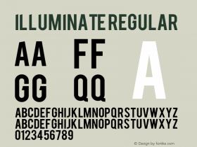
The illuminated sign on the facade uses caps from a wider style of Knockout.


 闽公网安备35010202000240号