Beautiful Infographics In GOOD Transparencies Archive On Flickr
Fans of wonderfully designed infographics – you know we are – should head over to Flickr account of GOOD magazine. GOOD is a collaboration of individuals, businesses, and non-profit organizations pushing the world forward. Since 2006 they've been making a magazine, videos, and events for "people who give a damn". The GOOD website is an ongoing exploration of what GOOD is and what it can be. The GOOD Transparencies Archive on Flickr is a repository of Transparencies that have run in past issues of GOOD and on their blog. Transparencies are graphical explorations of the data that surrounds us, and are published every Tuesday.
Vista Sans and its Titling Alternates, and Sabon in use in "Food Assistance: The Growth of Food Stamps", a collaboration between GOOD and Gavin Potenza.
The Flickr set is a beautiful showcase of the power of infographics; how the combination of text, numbers, symbols, and images can make even the most complex concepts understandable to a wide audience. The graphic style ranges from colourful hi-tech over hand drawn to photo realism. Although the popular adage "A picture is worth a thousand words" implies that intricate stories can be described with just a single still image, or that an image may be more influential than a substantial amount of text, it is the text that clarifies the context of those images. It is precisely the combination of both that is paramount when large amounts of data must be absorbed quickly. The typeface choice plays a crucial role – the letters must be robust enough to be easy to read even in small sizes, plus they have to hold their own against the surrounding graphics. Even more important are the numerals: for example the shapes of 3, 6, 8, and 9 should be sufficiently differentiated as to not be confused with each other (this is why Helvetica is such a poor choice).
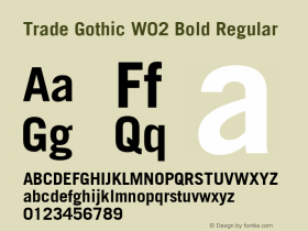
Trade Gothic Bold used in "Knot Tied: A History Of Gay Marriage Bans", a collaboration between GOOD and Timko & Klick.
A quick run through the set reveals that GOOD have adopted Xavier Dupré's popular Vista Sans – a sans with hints of blackletter – next to their "corporate face" Trade Gothic Bold. This timeless straight-sided sans by Jackson Burke is joined by Benton Sans, the Font Bureau's comprehensive reworking of the News/Trade Gothic model. It is also sometimes substituted with Alternate Gothic for even more compact setting. Furthermore there's traces of Doric, the chunky sans specifically designed by Walter Tracy to withstand printing in less than optimal conditions and tiny sizes. Sabon is used for blocks of running text.
Benton Sans is used in "Earth: A Glimpse Into Our Carbon-filled Future", acollaboration between GOOD and Life of the Mind.
Header image:"Lobbyists: Who Is Greasing the Wheels of Congress?", a collaboration between GOOD and Piece Studio.










 闽公网安备35010202000240号