


Spotify website (2015)

导语Source: http://spotify.com.License: All Rights Reserved.The Spoti


Source: http://spotify.com.License: All Rights Reserved.
The Spotify website has been redesigned. Proxima Nova has been replaced withLL Circular— cf. Spotify brand and website (2013). The site now uses four (upright) weights from the popular typeface family by Laurenz Brunner. The spacing has been tightened, even for text sizes, although to a lesser degree than for display.

Source: http://spotify.com.License: All Rights Reserved.

Source: http://spotify.com.License: All Rights Reserved.

相关字体家族
-
 801 关注
 -
 4473 关注
 -
 1216 关注
 -
 1088 关注
 -
 848 关注
 -
 1594 关注
 -
 492 关注
 -
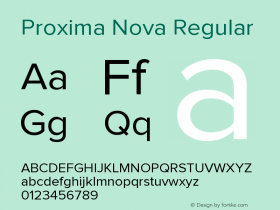 Proxima Nova
- Regular
- Bold
- Italic
- Bold Italic
- Semi Bold
- Unknown
- Light Italic
- Thin
- Extra Bold
- Light
- Thin Italic
- Black Italic
- Black
- Bold Condensed
- Bold Extra Condensed
- Bold Extra Condensed Italic
- Extra Bold Condensed
- Extra Bold Italic
- Regular Italic
- Semi Bold Condensed
- Light Condensed Italic
- Extra Bold Condensed Italic
- Extra Bold Extra Condensed
- Extra Bold Extra Condensed Italic
- Light Condensed
- Semi Bold Italic
- Black Condensed Italic
- Light Extra Condensed
- Light Extra Condensed Italic
- Black Condensed
- Semi Bold Condensed Italic
- Regular Condensed Italic
- Regular Extra Condensed Italic
- Semi Bold Extra Condensed
- Semi Bold Extra Condensed Italic
- Thin Condensed
- Thin Condensed Italic
- Thin Extra Condensed
- Thin Extra Condensed Italic
- Black Extra Condensed Italic
- Black Extra Condensed
- Bold Condensed Italic
21391 关注 -
 1362 关注
相关字体设计师

Spotify website (2015) 网友点评
Spotify website (2015) 最新评论
暂无相关评论


推荐字体资讯

 闽公网安备35010202000240号