


Beyond Helvetica: 9 More Résumé Fonts That Stand Out, According To Designers


Times New Roman--the font found in 12-point size on term papers everywhere--has officially been snubbed. According to an article on Bloomberg Business, the typeface is a big no-no for résumé, along with the flowery Zaphino and the comically wonky Comic Sans. Instead, the author urges readers to opt for Helvetica, the font praised by hipsters and businessmen alike.
But, according to Art Director and Letterer Kevin Cardell, Times New Roman isn't an inherently off-putting choice--it's just become a hackneyed option because it's used so frequently. "The poor application of the font is to blame," he told The Huffington Post. "So in a sea of résumés, it definitely suffocates." To avoid a similar fate, we suggest picking a less common font. Sure, Helvetica is stalwart, but similar options may give your CV a boost. Here are 9 fonts designers recommend using on a résumé:
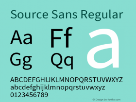
1. Source Sans Pro
Adobe
Designer Jack Harvatt says the narrow structure of Adobe's Source Sans Pro makes it perfect "for large bodies of text."

2. Gotham
Harvatt says Gotham Light is "a personal favorite," calling it "a clean and simple typeface which gives a smart and considered look to any work."

3. Tiempos
by Klim Type Foundry
Art Director and Letterer Kevin Cardell selected a few more ornate options, including Tiempos, which is actually a unique riff on Times New Roman.

4. Harriet
by Okay Type Foundry
Cardell says Harriet, which was inspired by the popular Baskerville font, is a great choice because it's available in Opentype, which is compatible with both Mac and PC.

5. Caponi
by Commercial Type
For a more conventional option, Cardell suggests this "contemporary and utilitarian" typeface.

6. Proxima Nova
by Mark Simonson
Designer Jillian Adel says Proxima Nova is "a friendlier font, that lives in between Gotham and Helvetica." The only potential drawback, she says, is that it is somewhat widely used.

7. Roboto
by Christian Robertson
Roboto is another font that's both clean, friendly and easy to read in large swaths. Adel says, "It isn't so wide as Proxima, so you'll naturally be able to fit more copy on a page."

8. Lora
Cyreal
For something less modern-looking, Adel suggests Lora, which is "really easy to read and way airier than Times New Roman."

9. Helvetica
Okay, okay. A list of ideal clean-looking fonts wouldn't be complete without Helvetica--even if it can be spotted on ads, logos, and everywhere in between. Harvatt calls it "the true foundry of modern type," and, in spite of its omnipresence, the top choice for a résumé.

For more on typography, check out our roundups of unique fonts here, here, and here.
CORRECTION:An earlier version of this article listed Source Sans Pro as a font created by Google. It was created by Adobe, and, as an open source typeface family, can be downloaded from Google Fonts, and elsewhere.


 闽公网安备35010202000240号