


Vintage Ads Reveal Fashions And Trends In Type And Commercial Lettering


For graphic designers and typographers vintage ads are more than just eye candy. Posters and advertisements from specific time periods tell us quite a lot about fashions and trends in type. This can be extremely useful when doing genre or period work. Just like newspapers dating from 1973 is not the brightest of ideas, Vintage Ad Browser helps us produce historically correct designs.

"Pastis Olive, comme à Marseille …" poster | Marc, 1930s
The very bold Art Deco geometric sans "Pastis Olive" can be recreated faithfully with Mostra Nuova Black.
Vintage Ad Browser – the sister site of Cover Browser – was created in 2009/2010 and released in 2010, by Philipp Lenssen, a native German currently living in China. The site aims to collect vintage ads from a variety of sources, including comic books, CD-Roms, websites, APIs, visitors' submissions, book, magazine & comic book scans, and more. At the moment it contains more than 120,000 ads categorised in a variety of classifications. Within those categories the ads are listed chronologically per decade for easy period-specific browsing. A great resource.

Magazine ad announcing the 1978 Pontiac Firebird GM | 1978
Although it has virtually disappeared from the visual landscape, Souvenir Gothic – the sans counterpart to Ed Benguiat's ITC Souvenir – was a common text face in the lates seventies, early eighties.

"Houbigant Gifts for Men, Fougere Royale Art Deco" magazine ad | 1935
In the first half of the twentieth century most ad headlines were hand lettered by skilled lettering artists. Fortunately many of these lettering styles have now been turned into digital fonts, like the fantastic Bluemlein Collection from Sudtipos.

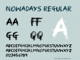
"United Air Lines – All the important people fly nowadays" magazine ad | 1954
In the 1920s clarendon/ionic typefaces were used for body matter, mostly in newspapers, but during their revival in the fifties they were popular display faces.

Kodak Developing Machine magazine ad | 1903
Windsor is heavily inspired by the serif faces from the Arts & Crafts movement from the turn of the last century.

North Korean propaganda poster (no details)


 闽公网安备35010202000240号