


Of Mice And Men by John Steinbeck, first edition


Source: http://www.manhattanrarebooks.com.License: All Rights Reserved.
There isn't any type on the front and spine of the jacket for qualifies for the inclusion on Fonts In Use: the freely-drawn caps are clearly based onCartoon. This caps-only typeface, a design by Howard Trafton, was first cast by Bauer in 1936 — only one year before the book was released. Apart from the fact that repeating letters are not identical, the only real departure from the model is the 'M' and how the center strokes meet – it's almost like an upside-down 'W', but not quite.
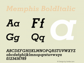
For the text on the back and the inner flaps,Memphiswas paired with the bold display face known asTitanicor Hercules. Its jolly 'A' and 'M' make me think of Robert Crumb's Keep on Truckin' cartoon.

License: All Rights Reserved.

License: All Rights Reserved.
Printed in the United States of America by J.J. Little and Ives Company, New York. Robert Josephy is credited as the designer. It is unclear whether he is responsible for the interior only, or also for the jacket.

Source: http://www.facsimiledustjackets.com.Facsimile Dust Jackets, LLC. License: All Rights Reserved.
Facsimile dust jacket

Source: https://www.flickr.com.Detail of a scan by James Puckett. License: CC BY.
Glyph set of Cartoon Bold


 闽公网安备35010202000240号