Fonts, Branding and the 2010 Winter Olympics
Type is one of the most important aspects of any branding solution. Type can easily differentiate an entity. It can unify diverse documents and products. It can also build powerful brand recognition. These are the issues that faced the creative team responsible for the branding of the 2010 Winter Olympic Games. The team was, however, aware of the three general guidelines for choosing a typeface to help create a brand identity.
If you can afford it, have a custom font created that is explicitly for your brand. If you can't afford a custom design, choose a typeface that is both distinctive and versatile. The key is to pick something that walks the fine line between a bland design that is versatile and a distinctive design that will not be appropriate for a multitude of uses.Chose a type family with several styles. Roman, italic and bold versions of a family are almost never enough for a large branding system. Perhaps not immediately, but sooner or later the client is going to run into instances where condensed, very bold, or even other styles may be required.Use typefaces that have legs. There are more than 200,000 fonts in the world to choose from. Many have a short life – and then become about as fashionable as tie-dyed t-shirts. Brands are supposed to last a long time. Pick a typeface that will not look out of date in a short time.
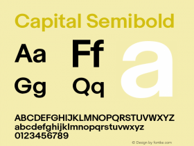
The Vancouver Organizing Committee took all three of the guidelines to heart when they chose the Neo® Sans typeface design as part of the branding for the 2010 Winter Olympics. Ali Gardiner, vice president of brand and creative services for the Vancouver Organizing Committee, sums it up perfectly. "We selected Neo Sans," she recalls, "because it felt contemporary and would represent Canada as a modern, progressive country, but it also feels like it will 'age well'…which is important for Olympic design because it's seen for decades and even centuries after the Games themselves. Neo Sans also has many weights, which made it practical across the tens of thousands of uses for which it would be required."
To add a little more distinction to the use of the design, the Vancouver team requested that a special custom font be developed by Monotype Imaging. According to Gardiner, "We thought that a unicase font (one that had several lowercase characters designed to the height and proportions of the capitals) could be used for display text in a way that felt both warm and friendly as well as contemporary and cool, which was how we wanted to represent Canada to the world. It also had the potential to become a unique, recognizable typeface for Vancouver 2010, which was important as we established our own look and feel and brand identity leading up to the Games."
Sebastian Lester, the designer of Neo Sans and the custom unicase font, is delighted that his design was chosen for the Winter Games. "I've always sought to design appealing, useful and versatile typefaces," he says. "The face that the design was chosen for the Winter Games confirms that I met my goal with Neo Sans."

Allan Haley is Director of Words & Letters at Monotype Imaging. Here he is responsible for strategic planning and creative implementation of just about everything related to typeface designs.







 闽公网安备35010202000240号