


Font Marathon

Last November, I decided on a whim to spend a whole weekend dedicated to designing a full, new, Arabic typeface. All I knew was that I wanted to design a fat, display, Naskh typeface. Because of the speed required, I relied almost entirely on intuition and produced something I wouldn't have been able to design under normal circumstances. I shared the progress during the weekend over social media; the process was so much fun that I proposed that we do this with our designers at Monotype. So last May, Jim Ford and Toshi Omagari met at our New York office and spent 3.5 days immersed in the process of creating two new typefaces from scratch. Below is a behind the scenes look.
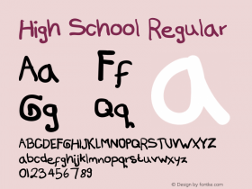
Jim, the Esca design you created during the marathon is a highly compressed display typeface that still manages to be elegant and with a mostly contained bubble of energy. What do you think of the importance of hand-drawn sketches in the design process? And are you able to spot the typefaces that started their life as pencil strokes on paper?
Jim: Sketching and drawing is a practice that applies to most creative processes for me, whether it's type, graphic design or art. I'm conscious of the fact that my mind works faster than I could ever work on a computer. So it's a way of getting out many ideas quickly and getting a sense for what's pulling you. It helps to organize your concept, and a strong concept, well executed, typically makes a good product.
Calligraphy and lettering are right in line with our profession; the pinnacles of type design are an understanding of form, rhythm, space and relationship. Those are just a few sensitivities, and both practices use these principles. But your hand can do interesting things that aren't so natural for a digital tool. So, these are tools that can work together. Your sketchbook is probably the purest reflection of 'what's going on in your mind at the moment' and you learn to think between the two directions – analog translating to digital and vice versa.
To answer your question – a truly authentic calligraphic typeface has specific qualities that shouldn't be streamlined digitally. You see a lot of these 'human touch' qualities in the late Hermann Zapf's work, for example. In Esca, the touch-points are just a wink – they're emphasized, crafted and cloned digitally. Otherwise the structure is more mathematical, kind of like designing a typeface that fits into high school lockers.
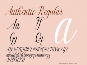
Toshi, you started the project from a completely different perspective. Your Cowhand typeface justifies words that are up to 20 letters long, so a word of one letter can be at the same width as that of 10 or even 20 letters. Your system of compression and expansion of letterforms was done via scripted interpolation in the Glyphs application. How much does scripting play a role in your everyday type design work, and when looking at the skills that a type designer needs to have, how high up would you rate this?
Toshi: I learned the Python programming language a few years ago out of necessity to stop asking our engineers for a new script every time I have a problem. I am very happy that I have done that, and I use Python whenever I see a possibility of automation or a new feature for the software I use. It makes me more efficient and the design process less repetitive. Nowadays, I write a code for almost every project.
Programming is becoming more and more important in my process, but scripts do not design a typeface for you – even if it can, it can't do it better than you can do. I think type design students need to develop type design skills more than anything else (unless you want to be a type engineer, which I believe is a career that's as equally sought after as type designer, if not more). You don't have to program to be a good type designer. But when used well, scripts can take you where you humanly can't, and they can be the most important design tool, of which Cowhand is my prime example – so much so that the idea of fixed width and script to do the job came to existence before the style of the typeface.
I had finished the script before the marathon started, and it was generating all alternates and OpenType features I needed in a few seconds. The idea of Cowhand had occurred to me years ago when Glyphs did not exist and I knew nothing about Python, and I considered it unfeasible because of the sheer amount of alternate letters I would have to draw (20 per letter!). It wasn't until after the marathon that I realized I had unconsciously revisited that old idea, which , this time around, seemed totally possible, and how far I had come, thanks to the new skill.
…kind of like designing a typeface that fits into high school lockers.
Now a two-part question to both Jim and Toshi. The only limitation of the Font Marathon was time. However, both your projects unintentionally introduced another factor and that was an investigation into how far letterforms can be pushed. With Jim, it was the extremely condensed design without the loss of its humanity, while with Toshi it was the flexibility of width while maintaining an acceptable level of variation that didn't break the typeface. So, did you guys feel a difference in your design approach that was influenced by the time constraint? And is pushing the boundaries in both your projects a product of the time limit or the freedom of experimentation?
Jim: Not so much a difference in design approach. It started like many digitizations – you're in a hurry to get enough letters to set key words and text. I took time on the initial 'control letters' and tested them thoroughly. Then moved onto characteristic letters for proposed font names. The name is the 'flag' or 'mascot' of a typeface, and we needed it next day, so I brainstormed in advance. I also knew these letters would pave the way for the rest of the design. I saved problematic stuff for later, or created quick alternates to evaluate later. The trick for me was to make sound decisions, once and for all, and then be consistent in carrying out those decisions in related shapes. Systems have to budge a little, though, and some initial decisions had to be revisited in the process. Everything goes through phases and checkpoints, which are prioritized. Usually it takes longer to lay the groundwork.
The Font Marathon was especially nice because we had consecutive full days to dedicate to just those designs. I'm used to juggling goals and deadlines and everything else, but this had the benefit of undivided focus. It's also fun to collaborate with friends who have similar objectives.
My typefaces are becoming more and more practical and predictable. That's just an attempt to make the designs useful and make the user experience more effortless. On the other hand, I try to keep drawings at an appropriate level of art (or design) that is also functional and respectful.
"Have you drawn an exclamation mark that is 6000 units wide?"
New display faces should be pushing the boundaries a bit, and you see those loose 'what if' moments a lot before the design is resolved. Often those crazy ideas have to be reined in or scrapped in favor of more practical solutions. Esca has its extreme qualities, but it works like a metronome. Somewhere around 200 bpm?
Toshi: There are styles that take less time to finish, such as those that require less kerning than usual, if not at all (e.g. monospaced), or reduced case (e.g. all-cap and unicase). I think the biggest challenge was to make a typeface in three days, probably using some of these time-saving strategies, while keeping the audience engaged since it was a social media event. The most difficult part was to find a good style that works well with the concept of of self-justifying words; you would have a problem of irregular stem thickness, spacing, or both at the same time. I think I found a good combination of style, and the concept which is executed automatically in isolation of the time.
There were some questions that were not immediately obvious until I started: mostly about how any glyph should look at the wider end of the scale. Have you drawn an exclamation mark that is 6000 units wide? Even wide letters like M and W were tough, as nobody has drawn them that wide in the past, and I couldn't find a solution in past typefaces. There were also questions of whether symbols should be considered as part of the word. For some English apostrophe combinations, I designed ligatures such as 'T for DON'T, which is one of the most creative glyphs in the typeface, and I might normally be too pedantic to approve. There was also an unconventional kerning solution to a monospace typeface which I came up with and added at the last minute.
As well as planned solutions, there were improvised ones because of the time, or dare I say, because it was excusable. While the short time-frame did call for some precautions, I think it disabled some other safety switches in my mind.
Is there anything from the whole Font Marathon experience that you would take over into your future designs?
Toshi: I wouldn't mind doing another marathon just for fun or for the challenge. If a stranger asks me to make a typeface in a few days just because I've done it in the past, the answer is no.
Let me clarify one thing for the readership, which may not be familiar with type design process. Thanks to modern software, you can make a typeface in a short time, sometimes in a matter of a few days, but you won't get the typeface you want this way. Creating a typeface very quickly is possible when time is the only concern and it's okay to compromise everything else, including design, quality, glyph set, client's feedback and the designer's life. Express rate or rush charges could apply if you're commissioning such a project. As much as it is a personal challenge, the Font Marathon is a little magic trick and won't change the fact that a good typeface takes a much longer journey. By comparison, what we do every day is a Spartathlon. It's le Tour de France. It's a pilgrimage.
As for the future of the typeface, I intend to fully extend Cowhand. I have an idea for a new family member too.
Jim: I think it's really fun to experience the process in a foreign environment. My typefaces tend to become very personal, and sometimes they reflect the time and place in which you made them. Esca has a story and memories associated with it, so I'll always think of it as a symbol of my 'New York City experience.'
Now, it's not very feasible to go to exotic locations to make fonts and get other designers on board at the same time. Normally, if I'm traveling, I wouldn't want to be working the entire time. But if it were feasible, I think your surroundings and the 'magic in the air' can have a profound effect on your work.


 闽公网安备35010202000240号