


Italics: Typography's Aristocrats

Italics are the aristocrats of type: elegant, beautiful, and dignified. Their history can be traced back to a time when only scribes and the most educated communicated with the written word. When they were first made into fonts, italics were designed to be communication tools for the most affluent readers.
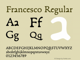
Traditional typographic history would have us believe that Aldus Manutius invented italic types, in the 14th century, as a space saving device. The story is told that Aldus paid the type designer Francesco Griffo da Bologna to develop a cursive type for a new series of small books that he was planning to produce. It is said that Aldus's goal was to cut paper costs and thus make his publications less expensive. These inexpensive books would thus be available to those who previously could not afford them. Then, as now, paper was expensive, but saving paper was not Aldus's goal in the creating of italic type – and Aldus never sold an "inexpensive" book.
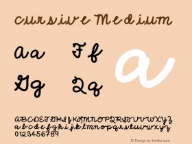
Aldus's italic type evolved from a popular writing style used by the educated. Its heritage can be traced back to Niccolo de Niccoli, an Italian scholar of the early 15th century. De Niccoli started to oblique and added flourishes to his letters when "he wished to write in a faster more relaxed fashion than usual." By the mid-century other scholars began to imitate his writing style, and by the late 1400s, italic became the official writing style of the educated, and of the professional scribes of southern Italy. In fact, the style came to be called Cancellaresca because of the large volume of work produced in that type for the city chancelleries.
Most of Aldus' customers for his books were the same people who used the cursive style of writing. In adapting the style to print, he and Griffo were making books more appealing to their intended audience. Today, we would call this concept creative marketing.
Aldus's Idea proved very successful; so successful in fact that other printers felt obliged to produce their own books in this new typestyle. The problem was that Aldus knew a product differentiator when he saw one, and was not about to sell fonts of his new invention to the competition. So the early printers did what has become a tradition in the history of type design – they copied the designs they could not buy. Not wishing to call attention to the plagiarism, but still needing to give the new offering a name, they chose "italic," after Italy, the country in which Aldus worked.

Allan Haley is Director of Words & Letters at Monotype Imaging. Here he is responsible for strategic planning and creative implementation of just about everything related to typeface designs.


 闽公网安备35010202000240号