


Top 100 Fonts.com Web Fonts for October 2015

Whether you call them slab serif, square serif, or Egyptian, you know them when you see them — sturdy, nearly monoweight designs with blunt, straight-edged serifs and a no-nonsense attitude. The Rockwell® family of typefaces is a fine example of this appealing and eminently usable style.
Rockwell fonts continue to prove themselves as a robust and adaptable design tools. An octogenarian, the design has migrated from metal type, to phototype and now sits at 21 in October's Top 100 Fonts.com Web Fonts list.

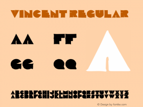
Rockwell can trace its roots back to the London type founder, Vincent Figgins, who released the first successful slab, or "square," serif typeface in 1815. The face was a cap-only design called Antique and was offered in three sizes.
"Slab serifs: you know them when you see them—sturdy, nearly monoweight designs with blunt, straight-edged serifs and a no-nonsense attitude."
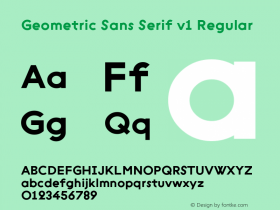
By 1825, more slab serif typefaces appeared, now with lowercase characters. The popularity of these designs waxed and then waned again during the first three decades of the twentieth century, until geometric sans serif typefaces became popular. Soon, new slab serif typefaces patterned after geometric shapes began to be released. The Rockwell family, first issued in 1933, is Monotype's answer to this typographic style.
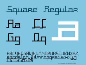
The complete Rockwell family includes a total of 9 typefaces: four weights of roman (three with italic counterparts) and two condensed designs. All are available as Web Fonts from Fonts.com.


 闽公网安备35010202000240号