


'Tis the Season for Fresh, Alive, Elegant Typography in the Design & Publishing Center

This is the time to design for comfortable, friendly feelings. Nothing better than some fresh, hand lettering or vintage lettering to denote family, fun and casual times. These are three font families that are very friendly, expert level, professionally designed but won't cost but a few dollars. Come sail away . . . Sail away with Nauti Gal . . .
A former lettering artist at Hallmark Cards, Rob Leuschke now has his own thriving design businesses, Alphabytes and the new TypeSETit. Rob showed great artistic promise at an early age. Hallmark Cards gave him the opportunity to learn from and work with some of the best lettering artists in the industry.
Inspired by the hand lettering design for a friend's boat, this contemporary script style, TheNautiGal is sexy yet formal with beautiful connectors. Rob Leuschke's Hand Lettering and Typographic Designs http://www.typesetit.com/
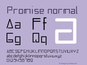
Full story :Nautigalsample used in LetterPress
You're gonna love Sant'Elia

Sant'Elia Script from Yellow Design Studio is a robust modern type family with regular and rough versions in six weights. Its letterforms are crisp and welcoming with a splash of verve.
Sant'Elia is a versatile family consisting of 44 fonts with extensive language support and advanced typographic features. Alternate versions feature angled strokes that inject extra energy. Rough weights include three different distress levels that can be mixed for added control and customization.
Full story : Sant'Elia Complete Family ~ Ryan Martinson ~ Yellow Design Studio
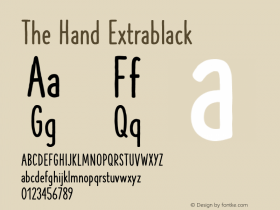
Here is a good look at the full alphabetCA Recape comes from American 50s lettering

In 2002, Thomas Schostok founded the Cape Arcona Type Foundry together with Stefan Claudius, to explore the typographical side of graphic design. The foundry offers a a large amount of typefaces that Thomas Schostok created since the 90's. (cape-arcona.com)
CA Recape is a weird and beautiful vintage script family with two styles. It's an excellent choice for creating logotypes, headlines, signs, poster and any design that requires a custom-made feeling.
Full story : CA Recape Family ~ Thomas Schostok ~ Cape-Arcona
Here are special characters and use
MORE from the world of fonts, lettering, calligraphy, and typography
 And, thanks for reading

Editor/Publisher : DTG Magazine
+FredShowker on Google+ or most social medias @Showker
Published online since 1988


 闽公网安备35010202000240号