


Enso Magazine homepage


Source: https://twitter.com.License: All Rights Reserved.
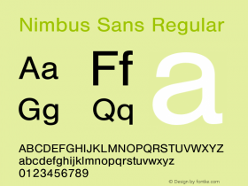
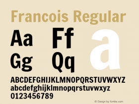
Readymag. The logo is set inNimbus Sans, URW's version of Helvetica which departs from its source most visibily in the extreme weights, or in the Bold Extended where Nimbus has nearly circular (rather than squared) counters in its stick-and-ball shapes ('bgpq'). Nimbus Sans' feeling overall is slightly off-kilter, almost like poster woodtype, and that gives it a vintage mid-century quality. Willy Fleckhaus'Plain, another Neo-Grotesk, this one by François Rappo for Optimo, which might have better spacing and openness for small sizes.
Specific issues of Enso will be covered in other entries here on Fonts In Use.
Source: http://enso.readymag.com.License: All Rights Reserved.
Source: http://enso.readymag.com.License: All Rights Reserved.


 闽公网安备35010202000240号