


Tomy Blip / World Tennis / Blip-o-mat


Source: https://www.flickr.com.Photo by Windell Oskay of Evil Mad Scientist. License: All Rights Reserved.

Source: https://www.flickr.com.Photo by Windell Oskay of Evil Mad Scientist. License: All Rights Reserved.

Source: http://www.handheldmuseum.com.License: All Rights Reserved.

Source: http://www.handheldmuseum.com.License: All Rights Reserved.
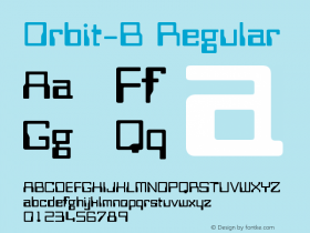
Besides the name, type played a major part in Tomy's futuristic aims: what could be more computerized thanComputer? The typeface was used for "The Digital Game" on the box, and the Blip logo was likely derived from Computer as well, but it needed some creative modification as the font had no lowercase. A cap 'L' works fine for the lowercase 'l', and a squashed cap 'P' can fake a minuscule if it descends below the baseline. Meanwhile, the logo on the unit itself appears to be set inOrbit-B, a design similar to Computer, but lighter and more square, with larger counters.

License: All Rights Reserved.
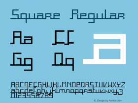
Japanese and German editions of Blip, courtesy sellers Data 70, another simplified take on the MICR aesthetic. The same font was also used on the packaging for the German "Blip-o-mat" (right).
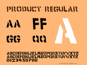
If you add it all up, this odd little game managed to utilize all three of the MICR-style fonts that were frequently found in futuristic films, entertainment, and other products throughout the 1970s and '80s. Read more about the relationship between this type genre and video gaming in an extensive article by Zach Whalen.


 闽公网安备35010202000240号