


Tobias Frere-Jones' new typeface, Mallory, is his first since his split with Jonathan Hoefler

Slide: 1 / of 7.
Caption: Tobias Frere-Jones designed "Mallory," his first commercial typeface since dissolving his business partnership with Jonathan Hoefler.Tobias Frere-Jones
Slide: 2 / of 7.
Caption: The sans-serif typeface blends the characteristics of british and american styles.Tobias Frere-Jones
Slide: 3 / of 7.
Caption: The typeface is simultaneously geometric and organic feeling.Tobias Frere-Jones
Slide: 4 / of 7.
Caption: The goal of combining two styles is to make a typeface as versatile as possible.Tobias Frere-Jones
Slide: 5 / of 7.
Caption: Frere-Jones says that he wanted the typeface to be as true to the letterforms as possible.Tobias Frere-Jones
Slide: 6 / of 7.
Caption: He designed the typeface to breath, so that each letter could find its ideal form even in their smallest sizes.Tobias Frere-Jones
Advertisement
Slide: 7 / of 7.
Caption: The result is a typeface that feels classic but not without distinctive personality.Tobias Frere-Jones
Related Galleries
Xiaomi's Cheap New Drone Achieves Impulse-Buy Airspace
Space Photos of the Week: Hangry Stars Munch Down a Cloud
Terrapattern is Like a Search Engine for Satellite Imagery
Slide: 1 / of 7
Caption: Tobias Frere-Jones designed "Mallory," his first commercial typeface since dissolving his business partnership with Jonathan Hoefler.Tobias Frere-Jones
Slide: 2 / of 7
Caption: The sans-serif typeface blends the characteristics of british and american styles.Tobias Frere-Jones
Slide: 3 / of 7
Caption: The typeface is simultaneously geometric and organic feeling.Tobias Frere-Jones
Slide: 4 / of 7
Caption: The goal of combining two styles is to make a typeface as versatile as possible.Tobias Frere-Jones
Slide: 5 / of 7
Caption: Frere-Jones says that he wanted the typeface to be as true to the letterforms as possible.Tobias Frere-Jones
Slide: 6 / of 7
Caption: He designed the typeface to breath, so that each letter could find its ideal form even in their smallest sizes.Tobias Frere-Jones
Slide: 7 / of 7
Caption: The result is a typeface that feels classic but not without distinctive personality.Tobias Frere-Jones
Related Galleries
Xiaomi's Cheap New Drone Achieves Impulse-Buy Airspace
Space Photos of the Week: Hangry Stars Munch Down a Cloud
Terrapattern is Like a Search Engine for Satellite Imagery
8
Typography, like many art forms, inevitably bears the mark of its maker. It's often more subtle than the brushstroke of a painter or the favored color scheme of a graphic designer, but the personality is there if you look for it—in the bend of the letterforms, the meticulous kerning, the slant of a terminal, and the innumerable little decisions that separate a good typeface from an excellent one.
For more than two decades, Tobias Frere-Jones has designed what many people consider to be excellent typefaces. For many years, the renowned designer shared hazily attributed authorship of those designs—Gotham, Retina, and Mercury among them—with Jonathan Hoefler, his longtime creative partner at Hoefler & Frere-Jones Type.
Their partnership dissolved acrimoniously last year, and Frere-Jones went on to create an eponymous one-man type foundry. Today, Frere-Jones is releasing Mallory, his first commercial typeface since splitting with Hoefler.
Frere-Jones Type
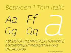
Until now, Frere-Jones has shied away from explicitly referencing himself in his work. As he once told New York magazine, "The name is the user's first point of contact with a typeface, and it should help the user rather than trumpet me." But Mallory is practically autobiographical; the typeface's moniker is a nod to Frere-Jones' middle name, and its sans-serif letterforms—which combine elements of American and British typefaces—are inspired by his childhood memories of growing up with a British mother and American father. Mallory is far from the designer's first typeface, but it's undoubtedly his most personal.
From a young age, Frere-Jones was attracted to letterforms without knowing it was typography he was drawn to. He recalls his mother returning from trips abroad with jars of marmalade and tins of marmite bearing distinctive labels. "I could open up the cupboard, and even before reading the words I could immediately tell which of these things came from England, and which of these things came from the supermarket down the street," he recalls. "I couldn't figure out why that was, and eventually I realized there was something about the letters that looked British."
The American lettering, next to the almost-chilly geometries of British type, had a "chummy, how-ya-doin" feeling to them, he says. It was a combination of forms that played off each other in interesting ways. Frere-Jones was curious about what might happen if he were to design a typeface with his same lineage. "It could very well turn out to be a confusing, muddled mess," he says. "Or it could turn into something interesting."
Frere-Jones Type
Mallory evokes Frere-Jones' cross-cultural upbringing by combining the austere geometry of British type design with the slight irreverence of the American tradition. The capital O, T, and P, for example, are resolute in their shapes, while the lowercase a, s, and g feel more fluid and friendly. Frere-Jones is consciously moving back and forth between geometric and organic shapes to create a pleasantly two-faced typeface. He designed subtle quirks into Mallory to separate it from the coldness of many sans-serifs. Subtly slanted terminals help readers distinguish between letters like C and O. The widow's peak of an M, the airiness of the O, the abruptness of the J's descender. Every formal choice feels intentional.
Miko McGinty, a book designer who's often worked with Frere-Jones' typefaces, believes Mallory is one of the elusive sans-serif typefaces that avoids falling flat in its simplicity. "I feel like there are a lot of really good choices for serif typefaces, but it was always a struggle to find a sans-serif that expressed something fresh and new and balanced," she says. That simplicity and directness are both the beauty and the downfall of many a sans-serif. "The quality of the letterform itself becomes so much more important," says McGinty.
Frere-Jones says he wanted the type family, with 8 weights and 26 styles including five MicroPlus variations, to be as true to the letterforms as possible. An O should be an O, a T should be a T. That sometimes required designing two versions of a letter. Take the capital Q, for example. One has a slight hooked tail, the other a straight tail that cuts through. The idea of the "letterness" of any given shape can be a challenging concept to grasp, but you get the sense that the letters in this family are stretching out, trying to breathe without losing themselves. "I wanted there to be enough width to let these curves show," he says. "You need a certain amount of room to let a circle do a full swing." The result is a typeface that's comfortably legible at even the lightest, smallest MicroPlus size and weight, which will be used on digital screens and in print.
Frere-Jones Type
Frere-Jones says he wanted to create a typeface that was both formal and friendly, and indeed, Mallory feels at once authoritative and conversational, like an acquaintance regaling you with a story he's told time and time again. As Chester Jenkins, co-founder of assign it qualities best explained through abstract descriptions of emotions. A typeface can make you feel secure or on edge; it can be friendly or cold. It takes on human qualities, if for no other reason than there is a human hand behind it. And indeed, there is a humanistic quality to Mallory, which is particularly evident in the heavier weights.
While the designers upbringing inspired Mallory's split personality, Frere-Jones says its design is less about paying homage to his cross-cultural roots that creating something that will play nicely with many typefaces. Letterforms often appear online and in print in combination with other typefaces. "I think it's an unrecognized skill that designers need to have, to not just understand how typography works but to pair typefaces together in the same way chefs need to know how ingredients will react with one another," he says. "Designers need to do the same thing with typefaces."
McGinty says Mallory is reminiscent of Interstate, a popular typeface Frere-Jones designed between 1993 and 1999 while at the digital type foundry Font Bureau. As for its reception, she envisions it having similar potential as Gotham, a blockbuster the Frere-Jones designed for GQ in 2000 and quickly became ubiquitous. "You go out into the world and see certain typefaces everywhere," McGinty says. "You see it popping up here and there and then spreading throughout visual culture and graphic design. I feel like this one has that quality to it. We will see it used widely."


 闽公网安备35010202000240号