


Top 100 Fonts.com Web Fonts for November 2015

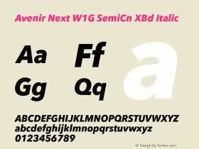
When Adrian Frutiger designed the Avenir® typeface, his goal was not to just to add another minimalist sans serif to the pantheon of geometric designs. "As a starting point, I set myself the task of rendering more human circular shapes that had been drawn using compasses," he explains. "I sat myself down in a small, quiet room and first drew an o contained within a perfect circle. Then I refined it, always with the goal of forming a readable curvature that was also easy on the eye." The result is a letter that may look perfectly round, but is actually slightly flattened on top and bottom – a shape that creates a horizontal stress. Frutiger incorporated this subtle foundational stress throughout the Avenir family. For example, the crossbar of the f and t, is just a little longer than other geometric sans and the down-strokes in characters like the A, K and V are minutely heaver than the up-stroke. Other characters, like the G, R, a and u, have a foundation in traditional serif typefaces.

Avenir, perhaps the most inviting and readable of geometric typefaces, was released in 1988 in three weights – each with a roman and oblique version. Several years later, in 2004, Frutiger, in close cooperation with Akira Kobayashi, completely reworked the Avenir design, and added new weights to the family. The result is the Avenir Next family. Additional weights were added again with the release of Avenir Next W1G. All 32 weights are available as Web fonts.
Avenir and Avenir Next were ranked second and third, respectfully, in last month's Top 100 Fonts.com Web Fonts list.


 闽公网安备35010202000240号