


FontCast #11 — Jim Parkinson, Part 2


In the second half of our interview with Jim (view part one here) we take a deeper look at his work, including the Rolling Stone 20th Anniversary cover and logos for the Ringling Bros. and Barnum & Bailey Circus and Newsweek. Jim talks about the difference between designing a logotype and a typeface and we get a glimpse at his plans for the future.
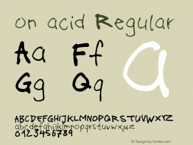
But first, legendary magazine and newspaper designer Roger Black, who has been working with Jim longer than nearly anyone, did us the service of offering an introduction to FontCast #11. Roger tells the story of meeting Jim in 1976 at Rolling Stone where he created the typeface that would later become Parkinson — "a sort of Nicolas Jenson on acid."
Click here to watch the Roger Black video or simply push play below.
And now part two of our two part series. Jim Parkinson offered us unfettered access to his home and archives, the result we think is a wonderfully candid meditation on his career and future. We hope you enjoy the product as much as we enjoyed creating it.
Click here to watch the FontCast or simply push play below.
FontCast is FontShop's video podcast featuring the most interesting figures in typography and design. Subscribe in iTunes or watch individual episodes on Vimeo and YouTube.
For more on Jim Parkinson don't forget to visit his website, view his font catalogue at FontShop.com, and take a look at our gallery of stills from our interview with Jim.


 闽公网安备35010202000240号