


History of the Linotype Company


Source: http://smile.amazon.com.© 2014 Rochester Institute of Technology and Frank J. Romano. License: All Rights Reserved.
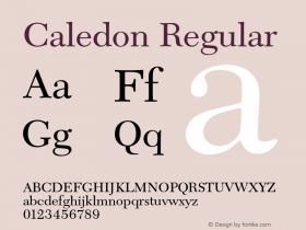
New Caledoniaat 9–10pt is a disappointment. Linotype's digital version of this great Dwiggins face is far too light and contrasty for this size, and it's especially strain-enducing when it falls to 7–8pt for footnotes. I would have set everything larger with less leading, or chosen something sturdier for the smallish body text required for this information-dense volume.Metro Novaworks well as a supporting family and is quite readable even when tiny, but there are also cases of unnecessarily loose leading in captions and sidebars.

Source: http://ritpress.rit.edu.© 2014 Rochester Institute of Technology and Frank J. Romano. License: All Rights Reserved.

Source: http://ritpress.rit.edu.© 2014 Rochester Institute of Technology and Frank J. Romano. License: All Rights Reserved.

Photo: Stephen Coles. © 2014 Rochester Institute of Technology and Frank J. Romano. License: All Rights Reserved.

Photo: Stephen Coles. © 2014 Rochester Institute of Technology and Frank J. Romano. License: All Rights Reserved.
The notes type is especially undersized for New Caledonia.

Photo: Stephen Coles. © 2014 Rochester Institute of Technology and Frank J. Romano. License: All Rights Reserved.
The Metro Nova sidebar text is aligned to the same baseline grid as the main text. I'm not sure this is necessary, and the result is slightly excessive leading for multiple paragraphs of type at this size.

Photo: Stephen Coles. © 2014 Rochester Institute of Technology and Frank J. Romano. License: All Rights Reserved.
Captions are also aligned to the same baseline grid as the main text. It works ok here, though the font color is quite light.

Photo: Stephen Coles. © 2014 Rochester Institute of Technology and Frank J. Romano. License: All Rights Reserved.
The light and loose captions are less successful when there is a lot of copy, and this image wrap is not ideal.

Photo: Stephen Coles. © 2014 Rochester Institute of Technology and Frank J. Romano. License: All Rights Reserved.

Photo: Stephen Coles. © 2014 Rochester Institute of Technology and Frank J. Romano. License: All Rights Reserved.


 闽公网安备35010202000240号