


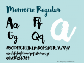
The 'Memoire' Typeface Changes Like a Memory as You Use It

A memory is a mutable thing. One moment it's in our minds, hard as concrete. The next, it's still there, yet different. With each passing day, the outline of what we remember softens; the veracity of what we've experienced gradually takes on a surreal filter.
The poignancy of this fact—that memories transform with time—is a frequent source of inspiration for artists and designers, who have long grappled with how to best convey the tenuous relationship between reality and perception. A new typeface called Memoire is designed to reflect the ever-shifting shapes memories take as we replay them in our minds. Designers Ryan Bugden and Michelle Wainer created the custom typeface for La Petite Mort, a biannual magazine produced by New York creative agency Sub Rosa. The font, used as the headline typeface for each of the magazine's 16 stories, evolves from page to page. "The core idea was that it would change over time—similar to how every time you revisit a memory, it in fact changes based on the current context you're in," Wainer says.
Slide: 1 / of 11.
Caption: Sub Rosa
Slide: 2 / of 11.
Caption: Sub Rosa
Slide: 3 / of 11.
Caption: Sub Rosa
Slide: 4 / of 11.
Caption: Sub Rosa
Slide: 5 / of 11.
Caption: Sub Rosa
Slide: 6 / of 11.
Caption: Sub Rosa
Advertisement
Slide: 7 / of 11.
Caption: Sub Rosa
Slide: 8 / of 11.
Caption: Sub Rosa
Slide: 9 / of 11.
Caption: Sub Rosa
Slide: 10 / of 11.
Caption: Sub Rosa
Slide: 11 / of 11.
Caption: Sub Rosa
Related Galleries
Xiaomi's Cheap New Drone Achieves Impulse-Buy Airspace
Space Photos of the Week: Hangry Stars Munch Down a Cloud
Terrapattern is Like a Search Engine for Satellite Imagery
Slide: 1 / of 11
Caption: Sub Rosa
Slide: 2 / of 11
Caption: Sub Rosa
Slide: 3 / of 11
Caption: Sub Rosa
Slide: 4 / of 11
Caption: Sub Rosa
Slide: 5 / of 11
Caption: Sub Rosa
Slide: 6 / of 11
Caption: Sub Rosa
Slide: 7 / of 11
Caption: Sub Rosa
Slide: 8 / of 11
Caption: Sub Rosa
Slide: 9 / of 11
Caption: Sub Rosa
Slide: 10 / of 11
Caption: Sub Rosa
Slide: 11 / of 11
Caption: Sub Rosa
Related Galleries
Xiaomi's Cheap New Drone Achieves Impulse-Buy Airspace
Space Photos of the Week: Hangry Stars Munch Down a Cloud
Terrapattern is Like a Search Engine for Satellite Imagery
12
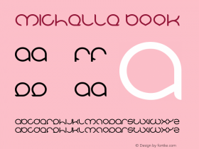
It's hard to see the changes at first. The sharpness of the serifs softens almost imperceptibly with every use. On the first page, edges are knife-like; by the last, they are almost friendly in their roundness. "The experience we had in mind was very subtle, something you feel before you notice," Bugden says.
Memoire is loosely based on De Vinne, a peculiar metal typeface Gustav Schroeder designed in the 19th century. In the days of metal type, degradation was an inevitable part of the process. Every time a letter was pressed, its edges softened "like eroding mountains," Wainer says. Of course, this process played out more gradually than it does with Memoire, where the degeneration is guided and intentional, facilitated by technology.
Bugden started by drawing two master fonts: The first a crisp-edged serif, the latter, a softer variation. From there he used software to generate fonts two through 15, which change by subtle degrees. Any alteration to the intermediary stages required a change to the master fonts.
At first, it appears that the typefaces increase in weight, but that's not so. "What's interesting about this typeface is it's not the weight of the typeface we're looking at, it's the quality of the curves," he says.
Memoire was designed for print, though it lives beautifully as a digital file, where you can see the transformation in hyper speed. Reading it in print is more of an exercise in perception, and in many ways, the typeface is a metaphor for memory layered upon yet another metaphor: By its very nature, the print page blurs and fades, each time it's touched.


 闽公网安备35010202000240号