


Throwing Out The (Typographic) Baby With The Bathwater

A couple of weeks ago, The University of Wisconsin-Green Bay announced that they were switching from the Arial® typeface they normally use to set email to the Century Gothic™ design. The move was part of the school's five-year plan to go green – and save money. The school claimed that switching typefaces would save 30% in ink and toner consumption.
Maybe.
While it is true that the strokes of the basic weight of Century Gothic are about 30% lighter than those in Arial, Century Gothic has wider proportions than Arial and takes about 30% more space to set the same content. The end result is that there is probably no savings in ink and toner – and more paper is potentially used.
(click for full size image)
Many entities are jumping on the green bandwagon these days – which is a good thing – and the right typefaces can clearly help save toner and paper. But selecting just any typeface to accomplish these goals may be (typographically) akin to throwing out the baby with the bath water. In addition to varying in weight and proportion, not all typefaces are created equal when it comes to performing well small text sizes. Since the purpose of email, and other text documents, is to provide information, it doesn't make sense to use a typeface that is not up to the job of providing that information clearly and efficiently.
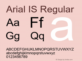
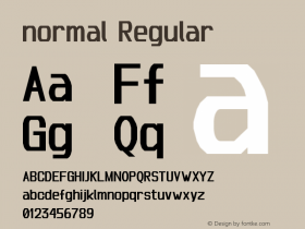
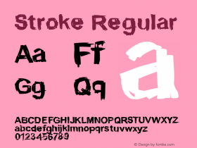
Arial is a typeface that would be considered by most type experts to be high on the legibility and readability scale. Century Gothic: not so much. Arial has characters like the two-storied lowercase 'a' and pot-hooked 't' that help make the design very legible. In addition, there is a slight modulation to the weight of the strokes that make up the characters – which improves the reading process. Century Gothic does not have these characteristics. In addition, Century Gothic is based on earlier designs like the Futura® and ITC Avant Garde® Gothic typefaces that were not developed for setting lengthy text copy. Both are designs that are best suited to setting headlines, subheads and very short blocks of copy.
(click for full size image)
So, in a number of ways, setting copy in Arial is an excellent way to be environmentally – and typographically – responsible.

Allan Haley is Director of Words & Letters at Monotype Imaging. Here he is responsible for strategic planning and creative implementation of just about everything related to typeface designs.


 闽公网安备35010202000240号