


Introducing "Width Test"

It seems that I am on roll, having released two new open source fonts on previous—and brief—article that was about the LOCL Test OpenType/CFF font simply pointed to the repository. This article will be longer. I promise.
The Adobe-Japan1-6 and are generally available only in commercial fonts.
螺
This font has the right price tag: free.
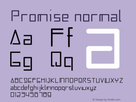
In terms of keyboard entry, anything ASCII (U+0020 through U+007E) is generally easy to type, and the primary scope of characters that can have varying width is ASCII, though there are other characters, such as Japanese katakana and Korean jamo, which can have width variation. Furthermore, most font implementations that support ASCII do so with proportional-width glyphs. Thus, Width Test (幅テスト haba tesuto in Japanese) includes a single proportional-width glyph that looks like a zero (it was taken from Source Code Pro Regular), has a 600-unit horizontal advance, and is encoded from U+0030 DIGIT ZERO. The remaining glyphs are accessible from this glyph via the 'fwid' (Full Widths), 'hwid' (Half Widths), 'twid' (Third Widths), or 'qwid' (Quarter Widths) GSUB features, but are also encoded from one through four (U+0031 through U+0034), respectively, for the purpose of creating reference tests.
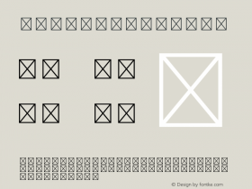
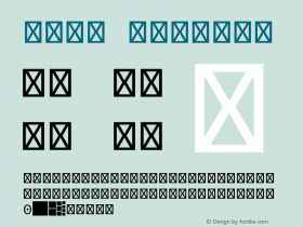
About the glyphs, besides CIDs 0 through 2 that serve as the (mandatory) .notdef, space (U+0020), and zero (U+0030), respectively, and have shapes consistent with their usages, the glyphs that make this font special have horizontal advances that match the expectations of the width-related crop marks:

The use cases for the 'fwid' and 'hwid' GSUB features are fairly well understood and implemented, but what about 'twid' and 'qwid'? One use case is referred to as tatechuyoko (縦中横 tatechūyoko in Japanese), which is horizontal text that is embedded in a vertical text string. Table 7-13 from page 495 of CJKV Information Processing, Second Edition, provides examples that show half-, third-, and quarter-width digits being used:

In closing, I would like to point out that this and other OpenType/CFF fonts that I have built for testing purpose are CID-keyed and intentionally use the special-purpose Adobe-Identity-0 ROS (Registry, Ordering, and Supplement), though they could have easily been built as conventional name-keyed OpenType/CFF fonts. In other words, such fonts also test the extent to which Adobe-Identity-0 ROS fonts can be used in various OSes and apps.
Anyway, enjoy!


 闽公网安备35010202000240号