


Appropriate Choices

The first rule of choosing display typefaces is to make an appropriate choice – appropriate to the delivery vehicle, content and reader.
Appropriate to Delivery Vehicle
The most appropriate display typeface for a small print environment will probably be a different design than one that is best for a large print environment. And neither of these might be appropriate for display copy on screen or in slide presentations.
The best font for presentation graphics, for example, is a sans serif (because it is more legible than a serif design), bold weight (to enable a high level of visibility) of somewhat condensed proportions (to obtain the maximum number of words in the smallest space).
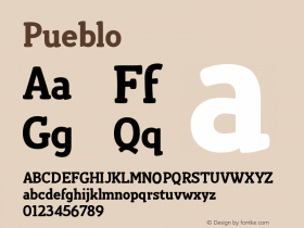
Typefaces for on-screen use should also have large x-heights and open counters. Large x-heights will take the best advantage of the limited screen pixels. The more decorative a design, however, the more problematic it becomes for Web sites and blogs. Very fancy or ornamental designs such as the Arriba-Arriba™ or ITC Wisteria™ typefaces might make excellent choices for posters and brochures, but they would probably not be the best choices for display type on screen. Slightly less fancy – but equally commanding – designs like the Dreamland™ and Pueblo™ typefaces would be better choices.
A few great display typefaces
Newspapers, which are almost always read under less than ideal circumstances, require sturdy, industrial strength designs such as the Egyptian Slate™ or ITC Franklin™ typefaces for headlines, while a catalog for women's clothing would do better with a more supple design like ITC Berkeley Oldstyle™ typeface. The same Berkeley Oldstyle, however, might not be the best choice for a web page banner, while the ITC CuppaJoe™ design might be.
Appropriate to Message
A catalog announcing a new line of Hawaiian shirts should use different typefaces than a brochure for women's lingerie; and announcements for a new, quarterly law journal report will be best served by yet different typefaces.
For that Hawaiian shirt announcement, a combination of the DIN Next™ typefaces might be a good choice. The women's lingerie might benefit from headlines set in the Pouty™ script typeface and text copy using part of the ITC Galliard™ family. The law journal? Try heads in the bold weight of the Felbridge™ typeface and text in the ITC Legacy™ Serif typeface family.
Appropriate to Audience
It's a pretty safe bet that counter-culture display faces like ITC Panic™ and ITC Schizoid™ designs will not appeal to an over-60s reader or that the Elegy™ or Diotima® Classic typefaces would resonate with a potential customer for skateboards. Typefaces like the Artistik™, Neuland™ and ITC Kick™ typefaces can be great display choices – but probably not for the readers of the quarterly financial reports of an international banking firm.

Allan Haley is Director of Words & Letters at Monotype Imaging. Here he is responsible for strategic planning and creative implementation of just about everything related to typeface designs.


 闽公网安备35010202000240号