Linotype launches new type system Generis
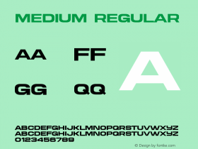
Linotype has released a new type system called Generis. Inspired by the simplicity of American gothic types, Generis consist of four distinct styles that share a uniform skeleton – allowing the styles to merge to creating new combinations, while retaining the original layout." />
Linotype has released a new type system called Generis. Inspired by the simplicity of American gothic types, Generis consist of four distinct styles that share a uniform skeleton – allowing the styles to merge to creating new combinations, while retaining the original layout.
The 'generic' style of the letters ensure a simplicity that is highly legible.
The four basic Generis styles are "Serif", which has a touch of traditional elegance; "Slab", with a more stable and technical look; the pared-down, clear American Gothic "Sans" and the invigoratingly contemporary and minimalistic "Simple", which is basically a sans serif with no hint of serifs at all. The underlying character of Generis spans across all four styles creating the impression of one cohesive alphabet with interchanging facets.
Thanks to the system's varying range of weights, elements can be combined to diversify, or enhance and highlight blocks of text or headlines. Each style is available in at least four different weights – light, regular, medium and bold. Additional weights, special caps, old style figures and italics round out the system, where design applications are most likely to be needed. Accented characters enable the implementation of 48 different Latin-based languages. All styles retain uniformly regulated proportions and, therefore, can be switched and interchanged without shifting the body of the text.
The inspiration for Generis designer Erik Faulhaber came from seeing different typefaces mixed together in business districts in the US. He envisioned a new type system with interrelated forms reduced to their essence. Therefore, the narrow width of the letters in Generis allows for more text to fit into a space. Elimination of descenders on capitals also permits closer spacing. Clear shapes and large interior counter-forms help achieve a greater readability.
The numbers have unmistakable forms and the mathematical symbols, with their systematic, numeric character width, help ensure error free recognition, simplifying typesetting of tables.
The Generis styles and their varying weights can be purchased either as a package or individually,





 闽公网安备35010202000240号