


Animated Typeface For RCA 2010 Animation Showreel


Yesterday I received an e-mail from Matthias Hoegg, a graduate from the Royal College of Art in London. In collaboration with fellow RCA graduate Mark El-Khatib, he developed an animated typeface for the titles of the 2010 Royal College of Art Animation Showreel. It was designed to visually link the printed content of the DVD booklet to the moving content on the disc itself.
Animation Alphabet from Matthias Hoegg on Vimeo.
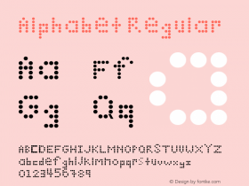
The Animation Alphabet was used to form the menu animation and intertitles on the DVD. On the showreel the designers wanted to convey a sense that they form a diverse group of animation directors sharing the same goals. This concept was applied to the typography as well – it was made up of many distinct parts that form the letters. In the animation Matthias Hoegg tried to give every component of the typography – horizontals, verticals, round shapes, etc. – a distinct character and texture.


Build-up of the typeface


The DVD disc itself is held in place by a cut and fold in the cover of the booklet.
Layouts by Mark El-Khatib, animation by Matthias Hoegg, DVD produced by Callum Cooper.


 闽公网安备35010202000240号