


The Birth Of A Magazine


Have you ever wondered how magazines come into being? Little White Lies made a wonderful short film that captures some of the love, care and hand-crafted passion that goes into the production of an issue of their magazine. LWLies is a British independent movie magazine that features cutting edge writing, illustration and photography to get under the skin of cinema. Because movies don't exist in a vacuum, they venture beyond the boundaries of the big screen, exploring the worlds of music, art, politics and pop culture to inform and illuminate the medium they love.
Bold, beautiful and unique, LWLies is a magazine on a mission – to reshape the debate across the movie landscape.
LWLies produce six issues each year, and for the two month period that they're working on a particular issue, the whole team totally immerse themselves in the movie and in the production process. While they obviously embrace digital in all forms, first and foremost LWLies are makers of honest, tangible and fine-smelling objects, hoping that this comes across in some way here.
Art director Paul Willoughby sent me some information about the typography and custom lettering used in the magazine. Several weights of the tech sans serif Neubau Grotesk are used for feature standfirsts and copy. This design by Stefan Gandl seems to be inspired by the awkward forms of certain European road sign alphabets, and can be categorised as an FF DIN alternative. Personally I think the unreasonably strict geometry of the character shapes and total lack of optical correction give it an unbalanced and clumsy appearance. Reviews copy and various other sections are set in Plantin. As Paul explains it, "the two typefaces complement each other very well – Neubau is stark, fresh, and quite cold in character, whilst Plantin is a warm, old school classic."
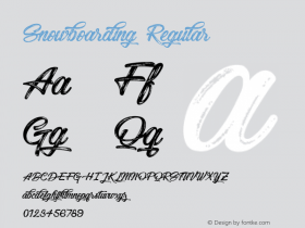
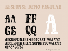
Each issue, LWLies takes a new film as the blueprint for its aesthetic, so occasionally things are changed in response to the film. Mostly it's the headline font that evolves while the standfirst and copy fonts stay the same. In addition to this LWLies explores custom typography because it's a dream brief. To be in a position where the design team can create whatever they want each issue is quite privileged, so they take full advantage of that to explore all kinds of creative avenues. All the custom type is created in-house.
LWLies is published by The Church Of London. This creative agency is motivated by passion – for publishing and design, for writing and filmmaking, for staging parties and exhibitions, and engaging with communities of like-minded people. From their offices in East London, TCOLondon's in-house team of 18 works alongside a vibrant network of contributors and collaborators on a wide range of projects for clients around the world. The agency publishes two magazines, LWLies and Huck, a bi-monthly lifestyle magazine rooted in surf, skate and snowboarding, which embody their passion for creating something of their own, and in doing so connecting with other like-minded individuals.
TCOLondon filmed this themselves over the course of November/December 2010, and the film was edited by friends at production company Archer's Mark. Darren Aronofsky's musical collaborator Clint Mansell kindly offered the use of the track A Swan is Born from his Black Swan soundtrack, and so this short film is called A Magazine is Born.


 闽公网安备35010202000240号