


Foundry Focus: Fontsmith


Fontsmith is a leading London-based type design studio founded in 1999 by Jason Smith. The studio consists of a compact and efficient team dedicated to designing and developing hight quality typefaces for both independent release as well as bespoke fonts for international clients. Last April Fontsmith added over a dozen type families to the FontShop catalogue. This seemed like the perfect opportunity to get (re)acquainted with the foundry and its founder, Jason Smith.

Jason Smith showing the weight progression in the letter 'i'.
How did you get into type design?
J A S O N S M I T H| "When I was 16, I marched off to Art College with my barely passed GCSE results. I wanted to do the Graphic Design course, but all the spaces had been taken. So I did Calligraphy, Lettering and Signwriting instead. Obviously this wasn't going to get me a job, so I concentrated on lettering and logotypes. Having a calligraphic background was a great start. I splashed ink around with various utensils and got a good feel for making marks. But it was only when I started working with David Quay that I really drew logo ideas, built up from expressive calligraphy and redrawn into typographic solutions. I started on book jackets for Penguin, advert headlines, company logos and lots of packaging. All sketched and inked and photographed, but it still wasn't graphic design. I learnt so much from David over that year and worked with various other typeface designers in the years to come, to just learn what I could."


Pencil drawings for lettering.
What are the significant aspects of type design you learned from collaborating with type designers like David Quay?
J A S O N S M I T H| "Well, I always was good at drawing and had a good eye for shapes and curves. David Quay taught me to balance those skills into letter forms. Back then everything was done by hand, ink and Polydraw, a few French curves, a scalpel knife, and a PMT Camera. Oh the joy!! This was an amazing grounding in the understanding and craft of designing lettering and type."


Inked lettering examples.
"Some years later I became the in-house lettering artist for a company called Wagstaffs. My job was to come up with the lettering styles to match product or brand: Quavers, Jaffa Cakes, Flake, Hovis, Ready Break, … they were all mine. There were also loads of cheeses, crisps, pickles, cereal, chocolate and so on. I was dealing with questions like 'How do you make a word look fizzy for a fizzy drink?' That was great fun. I remember walking around supermarkets only buying products I had done the lettering for!"


Rough sketches and pencil drawings for type design ideas.
When was Fontsmith founded, and how did it evolve from there?
J A S O N S M I T H| "Once I had set up Fontsmith in 1999 I became much more involved with corporate identities rather than consumer brands, dealing with questions like 'How do you make a company name look technical, holiday like, safe, or industrial?' I started to understand how brand values could be interpreted into type. Every branding project needs a typographic route. They weren't always used but it developed a different thought process and I was getting ever closer to being a designer working in graphics and branding."

Pencil drawing for FS Clerkenwell.
"My real talent was in creating bespoke typeface designs for Corporate Identities. Over the next few years I developed and designed a series of my own typeface designs and released them in my own library label. This was 2001 and I was one of the first independents to offer fonts online for sale via my own website. Since then I haven't looked back. There are now 5 of us at Fontsmith and 23 typeface families for sale."

The Fontsmith offices in London.

Part of the Fontsmith team evaluating designs; from left to right Emanuela, Helen, Phil, and Jason.
How did Fontsmith grow?
J A S O N S M I T H| "It is 10 years now since I launched my first typeface for retail and set up our website. Prior to this I had been working mainly on commissioned typefaces, for Post Office, Allied Irish Bank, SEAT, amongst many others. I continued to design logos for brands and was one of only a handful of people providing Hand Lettering in a digital form. Over the next few years I began to do some Television brand work. Creating Typeface for E4, the UK's first Freeview digital channel led to commissions for Channel 4 and BBC."

The Fontsmith designers getting their hands dirty; from left to right Jason, Phil, Fernando, and Emanuela.
"At this point it was time for Fontsmith to grow and I took on the then youthful Phil Garnham on a work placement. Phil studied graphic design at Middlesex Uni. So designing typefaces was quite different for him. He too had an eye for design, shape and balance. Taking him under my wing and teaching him what I had learnt was a good move. Phil is a natural born type designer and has an enormous heart for all design. In fact all the people at Fontsmith are naturally good at their jobs. The other two designers Emanuela Conidi and Fernando Mello both studied Typeface Design at University of Reading, but also studied print and architecture respectively. Helen, my studio manager, keeps us all sane and adds reality checks to the mix every now and again."

Jason checks a design and offers feedback.

Emanuela working on FS Blake.
Type design is equally creative (drawing glyphs) and technical (spacing and kerning, coding, and everything else). Are there certain aspects you particularly enjoy/dislike, and does this play a role in your collaborations?
J A S O N S M I T H| "Absolutely, this is exactly what I tell students who visit the studio. To design a typeface, the creative aspect comes from your artist soul and the time it takes to put an idea down on paper is your experience. The skill is in the craft and skill of carefully nurturing those designs in like a true craftsman. The last bit is the technical and production bit. A true modern type designer needs to be masterful of these combination of skills. My particular strengths are the initial design concepts and coming up with styles that I believe my clients require. I have always had a very good eye for balance and shape and my craft skills are honed whether it be pencil, ink or digital. My technical skills especially OpenType scripting and patience for kerning tables is somewhat to be desired. I have surrounded myself with a team of very talented people. Fontsmith is a company full of individuals with strengths that vary slightly from one to another, but the designer heart is still there."

Annotating printouts.
On some of the typefaces by other Fontsmith designers your name appears as well, so I assume you take on the role of art director. How do these collaborations work?
J A S O N S M I T H| "Ahh yes. I have always believed in giving proper credit to my designers. The lead designer's name always goes first. It is my company, my baby and I'm very passionate about what goes out the door so I am always influencing our designers in a positive way. It is my job to either brief them, influence them, inspire them or simply give my opinion. We are a very good little team and respect each other greatly. This is why it is a small 's' in Fontsmith."

Do you try to maintain a certain "house style" for the Fontsmith releases, to ensure the audience at large sees the library as a consistent body of work?
J A S O N S M I T H| "I think over the years as a unit Fontsmith has carved its own style and place in the market. This is clearly down to the individuals who work here. We all have slightly different design sensibilities, we are a team of individuals, but respectfully influence each other. I think of us as a band our fans have their favourite member."


Logo, channel identity, and sketches for bespoke typeface for E4.
Fontsmith often works for television broadcast. How did you land all those jobs for television stations?
J A S O N S M I T H| "I always wanted to work in television, originally doing titles or movie idents. I simply went out and sought the work. Of course as my portfolio was full of lettering and type design I ended up staring in a couple of TV adverts as William Shakespeare at his desk writing Sonnets using a Swans quill by candle light. I wrote some calligraphy for an advert promo. I just worked hard, got myself about. Eventually a colleague and friend give me my big break, when I did the E4 typeface. This got noticed by the wider TV and graphics audiences and was my opportunity… I simply tried a bit harder, and with a big helping of luck and gratitude along with I hope some talent, Fontsmith has become the name in type design for broadcast. We have designed typefaces for almost every British Television channel, as well as some of the worlds biggest and coolest companies."


Paintings by Jason Smith.
"These last ten years have been hard work and sometimes not that easy, but I am one of the lucky people in the world whom enjoys what they do for a living. However I do need a break sometimes and have taken to oil painting and photography in recent years as a creative pastime."
The Fontsmith collection @ FontShop
A utilitarian headline font inspired by the work of Alvar Aalto. FS Alvar is ideal for display headlines, advertising, and everything that's cool.
Finely tuned in its mechanical and organic shapes, FS Blake offers a harmonious mix of generous curves and cursive spikes. Compact and solid, the punchy heavy weight is emphatic in display sizes whilst the lighter weights offer a sensitive modern elegance, sympathetic to small text setting. Within each weight, FS Blake reveals a different aspect of its character to support a variety of applications. A lively and versatile, contrasted type family.
FS Clerkenwell is an inspired design, based on influences in and around the lively area of London. The face is quirky and useful for dramatic headlines, logos, and in large sizes.
FS Conrad is a unique graphic display typeface that is ideal for editorial, poster and exhibition design.
The inspiration for FS Dillon came from Fontsmith's exploration of the work and philosophy of the Bauhaus movement of the 1920s and 30s, their pursuit of simple, practical forms. To this they added a thoroughly modern flavour, stark yet warm, imbued with the quirky individuality that has become a Fontsmith signature. The letter forms are simple and direct. Compact, with a large x-height, they are built for maximum clarity, economy of space and impact. But that's not all. The Bauhaus sought beauty through function, and this typeface achieves that too.
FS Ingrid is a Scandinavian type of soft and subtle curves coupled with a cool hard edge. Designed with screen legibility in mind, Ingrid is a highly functional face with a sophisticated, understated elegance.
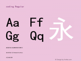
A cool sans serif, good looking and enthusiastic, FS Jack is honest, clear and to the point.
Originally designed for a new video-on-demand online service, FS Joey's weights are finely tuned for use both on screen and in print. Consistency and strength in its geometric construction make the typeface crisp and distinctive, while being remarkably relaxed in feel. Friendly and energetic, its letter forms are packed with surprising turns, making for an ideal corporate typeface. Their shapes will re-energise any identity, restoring freshness and vitality to your enterprise. FS Joey is formal, but it's here to party.
A headline face inspired by the iconic Japanese character, FS Kitty is friendly and cute, great for posters and products, point of sale and sweets!
A larger-than-life headline face inspired by the legendary football star. strong and truly unique, FS Pele looks great on posters, album covers, mastheads, and other display uses.
FS Rome is a beautiful classic Roman caps font, created by Jason when he was at college (many years ago). Jason took inspiration from the cast of the Trajan colum at the Victoria and Albert Museum in central London. It was originally drawn by hand with ink on polydraw, and later digitised. The design hopefully still reflects this hand-crafted essence that is so important when taking historical lettering and modernising it for today's market in a way that designers can use effortlessly.
FS Rufus is a cheeky offbeat, quirky and benevolent design. Wide forms with curious ink-traps combine to create an uncommon and unique personality. Headlines and text sizes are equally at home using this typeface.
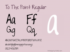
FS Sally is a refreshingly simple design that offers a crafted elegant finish to display and text typographies. Modern in its transitional style but with a hint of the classic, FS Sally enables its forms to sit with a distinctive aplomb in both small and large amounts of text.
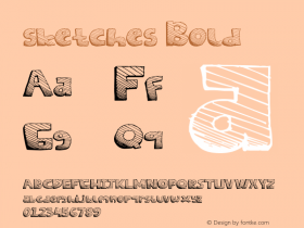
An energetic hand-drawn script with a chalky texture, FS Sammy has an informal and honest personality for branding, packaging and billboard advertising.
FS Sinclair is a smart, switched-on face inspired by the inventor of the ZX Spectrum. This modern grid-based design looks great in text and display use.
FS Sophie was inspired by and designed with ATTIK UK. A stylish and beautiful typeface designed for use in advertising and publishing, FS Sophie has a clean, dynamic and distinctive form.


 闽公网安备35010202000240号