


Vesta: Serif or Sans Serif?

 Gerard Unger, designer of the Vesta™ typeface family, once received an e-mail from a graphic designer who thought he saw serifs while reading text copy set in the typeface. "It has the weight contrast of a typeface with serifs," says Unger, "which may have caused an optical illusion. The designer thought I had designed the missing link between sans serif and serif typefaces."
Where most sans serif typefaces have strokes that are close to monoline, Unger chose to add some modulation to those in Vesta. He wanted to ensure the design would be applicable for use in long blocks of text copy and knew that this stroke modulation would aid the reading process. Both Vesta and its display companion the BigVesta™ design also benefit from open letter shapes, large counters and relatively flat curves that create a horizontal stress – all also aiding readability.
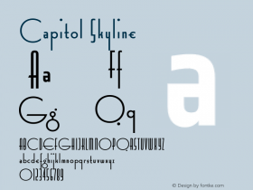
Vesta and BigVesta stem from two sources. "I took the lettering on the frieze of the little temple of Vesta in Tivoli as the starting point," says Unger. His typeface was to be used for signage and an information system for the city of Rome during its Jubilee 2000 celebration, and Unger wanted to create a type design that would continue the 2,000-year Roman tradition of public lettering. His clients were intrigued by the design but decided they wanted a typeface with serifs instead. After all, Rome is often considered the birthplace of the serif. Unger's new serif typeface became his Capitolium™ family.
While developing Vesta, Unger was also influenced by French sans serif typefaces of the 1940s and 1950s, designs that favored a marked contrast in character stroke weights.
Vesta is narrower than sans serifs typefaces that are commonly used. This makes Vesta a good choice for setting copy for periodicals and in other environments where high levels of character legibility and economy of space are important typographical goals.
The temple of Vesta, which dates back to the early first century B.C., holds typographic significance beyond Unger's choice as a typeface name. According to James Mosley, author of "The Nymph and the Grot: the revival of the sanserif letter," the temple of Vesta is the ancestral home of all sans serif typefaces.
Vesta and BigVesta are available in seven weights, ranging from an elegant light to an authoritative black – each with a complementary, cursive italic. To supplement the large Pro font character set, which supports most Central European and many Eastern European languages, the Vesta family also has small caps and old style figures.
Click here to learn more about Vesta and BigVesta.

Allan Haley is Director of Words & Letters at Monotype Imaging. Here he is responsible for strategic planning and creative implementation of just about everything related to typeface designs.


 闽公网安备35010202000240号