


Skyrill makes type explode

Type Fluid is an experimental project from Hussain and Ali Almossawi, aka Skyrill. They took every letter of the alphabet, extruded them in 3D and then blew them up as if under extreme pressure to create a series of inspired CG artworks.
Syrill was founded by Hussain and Ali in 2009. "Ali and I have been working together as a team since childhood,," says Hussain, "and enjoy working on great projects and [with] clients as a team." Hussain's 'day job' is as a graphic designer at the ad agency Ogilvy and Mather, producing work for clients including Adidas, Puma, Americna Express, HSBC, Unilever and Kraft Food.
Type Fluid was conceived as a chance for the brothers to explore how letterforms and liquids can be combined.

"I really love how fluids look like when their floating in the air like rain drops, or hitting the ground and the splash it makes." says Hussian. "That made me want to work along those lines of mixing typography and fluids, and that's how this experimentation got started."
Hussein tried a number of mixes of type and fluids, and many different executions. The one that he liked most was to make each letter loook as if it was made from paint--and then showing how them explode under pressure.
"My concept was to capture the most interesting moments while this happens, while still keeping the letterform noticeable," he says. "Once I was satisfied with making my 'a', I moved on to the other letters."


The letters were built and animated using 3ds Max and the RealFlow fluid simulation software, which plugs-in to Autodesk's 3D suite.

The letters were built in 3ds Max (above), extruded from 2D type to a width that would be enough for the liquids to flow through them in a visually pleasing way.

These shapes were then passed to RealFlow (above), where a particle emitter was used to fill them with 'paint' as if pouring it in from a can. Hussein had to adjust the gravity and pressure so the letters would fill completely.

Once each letter was full, he released the liquid from the constraints of the original letter shape (above), letting the liquid explode and splash on the ground. After more tweaking, Hussain imported the letter back to 3ds Max (below) to finalise the materials and rendering.

As you'd expect, some of the more intricate letterforms proved problematic.
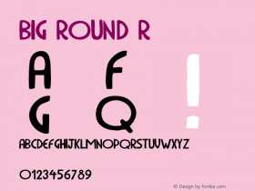
"Some letters have a lot of space inside of them compared to others, for example the 'g'. It has a big round shape in the top, and a small part at the bottom. That creates inconsistency and makes it hard to keep the whole letter form unified when exploding. Another reason for that is the direction the liquid moves in [is different in different parts of the letter]. One part is a circular motion and the other is an arc, which results in a different end result.
Hussain says that each letter required its own process based on what it looked like--and a lot of trial and error. Some letters--especially wide letters such as 'm' and 'w'--required using multiple emitters at different directions and speeds, and experimenting with how they would collide with each other. A good example of that is the letter 'm' or 'w' (below).

Other challenging letterforms included those with counters--such as 'e'--and bars--such as 'f'.
"All the small parts of a letter make it difficult, since they disappear as soon as you make the letter form go free and explode," says Hussain. "The solution was to edit the typeface, and make some parts bigger or longer, until it would work properly. Therefore, you need lots of patience and allowing yourself to explore all the possibilities of how different things could end up looking."
Below are some videos of how the letters were created.


 闽公网安备35010202000240号