


What the font on an album cover may tell you about what lies inside (but occasionally doesn't)

A HuffPost Exclusive

My interest in fonts began when I was 11, and I continue to blame David Bowie.
I am on a bus in London, and I have just blown many weeks of pocket money on the Hunky Dory album, the one with "Life on Mars?" and "Changes". I think my older brother is on the seat alongside, and during the half-hour ride from Leicester Square to our home in the northern suburbs we gawp at the album sleeve, a tinted, textured photograph of the singer clutching his hair with a possessed gazed.
Now we'd call it precious, but at the time it seemed meaningful. As did the type at the top left corner featuring his name and the title, a font with a fat spacey feel that promised unusualness inside.
Our expectations were realised as soon as the needle hit the grooves--a fulfilling example of type telling it like it is.
It's a godawful small affair, typography, especially these days with those tiny images you get when you buy an album track on iTunes. What used to be a proper square canvas is now almost a postage stamp, and although we can blow up the images onscreen, the joy of speculating about what an intricately designed and carefully chosen set of letters may reveal about the innards have long gone.
So here, as Hunky Dory celebrates its 40th anniversary, is my utterly subjective Top Seven Fonts on Old Albums chart, selected more for their care with type as the sounds within, although in most cases those aren't bad either.
Just My Type by Simon Garfield is published by Gotham.
Tell us about your favorite album typography in the comments!
What the font on an album cover may tell you about what lies inside (but occasionally doesn't)
What the font on an album cover may tell you about what lies inside (but occasionally doesn't)
1
of
7
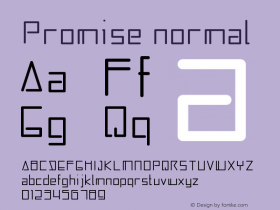
Brothers by The Black Keys
Much fuss when this extraordinary image appeared last year, and I can't remember another occasion when a purely typographic sleeve caused either so much commotion nor had such a positive effect on sales.
It left no room for misinterpretation: "This is an album by The Black Keys. The name of this album is Brothers." The text was one of the boldest and most associative available: Cooper Black, an American type from the 20s that hit the musical big time on the front of the Beach Boys' "Pet Sounds" album.
Its designer, Oswald Bruce Cooper, a former Chicago advertising man, feared that it would only achieve "a tiresome effect from the too frequent repetition of the same quirk and curve."
In fact he achieved something spectacular-a serif face that looked like a sans serif. Cooper Black is the sort of font the oils in a lava lamp would form if smashed to the floor, and I've always loved it since it spelt out the name "Garfield" on the comic strips.
Share this slide:


 闽公网安备35010202000240号