


U&lc Volume Thirteen-Three Special Typefaces

 ITC announced three new typeface families in the issues of Volume Thirteen of U&lc. In addition, four new additions to the Families To Remember series were published and the Milestones series continued with a feature article on Monotype's Stanley Morison. Examples of great illustration also continued to enliven the publication.
The ITC Goudy Sans®, ITC Gamma® and ITC Slimbach® typefaces made important debuts in the pages of U&lc. With the announcement of ITC Slimbach, ITC introduced a new typeface designer – as well as a new typeface family – to the graphic design community. Robert Slimbach's self-stated goal in drawing his first commercial typeface was "to design a contemporary text typeface with a progressive look; a typeface which was a balance of innovation, clarity and legibility." From this beginning, Slimbach has become one of the luminaries of the craft of type design. He has won many awards for his typefaces, including the rarely awarded Charles Peignot Award from the Association Typographique Internationale, and repeated TDC2 awards from the Type Directors Club.
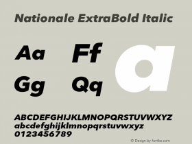
ITC Gamma takes its name from the third letter of the Greek alphabet. Coincidentally (or not), ITC Gamma is the third ITC release from the type designer Jovica Veljovic. His earlier ITC Veljovic® and ITC Esprit® typefaces were based on classic roman letterforms. Such is the case with ITC Gamma, but the crispness and obvious calligraphic influences of Veljovic's previous typefaces have been replaced with softer, more studied, shapes.
[pullshow]One of the most original and distinctive sans serif typefaces of the early 20th century was drawn by Frederic Goudy. In 1929, the Lanston Monotype Company challenged Goudy to create a sans serif different from the norm. Drawing from Roman lapidary inscriptions, Goudy crafted a type design that was less formal than existing sans serifs, with a cursive italic rather than the more common obliqued roman.
 In many ways, Goudy's sans serif was more modern than the geometric designs of the time. Well-known typographer and typographic historian Robert Bringhurst wrote, "[pullthis]ITC Goudy Sans is the spiritual father of several recent sans serifs[/pullthis], including Erik Spiekermann's FF Meta® and ITC Officina™ Sans typefaces – and like them, it is not quite as sans as the name suggests."
The ITC Goudy Sans family has had four distinct "growth spurts" over the years. Goudy originally created the three designs of heavy, light, and light italic for metal typesetting. Many years later, Compugraphic Corp. revived Goudy's original work for photocomposition. Several improvements were made to the original design, and three more faces were added to the family. In 1986, ITC re-released the design under a license agreement with Compugraphic, and the family was enlarged again to its present size of four weights and corresponding italics.
Click the PDFs below to find out what else was in U&lc Volume Thirteen.
Low Resolution:
Volume 13-1 (Low Res).pdf (16.3 MB)
Volume 13-2 (Low Res).pdf (16.2 MB)
Volume 13-3 (Low Res).pdf (16.2 MB)
Volume 13-4 (Low Res).pdf (14.5 MB)
High Resolution:
Volume 13-1.pdf (69.9 MB)
Volume 13-2.pdf (70.9 MB)
Volume 13-3.pdf (77.3 MB)
Volume 13-4.pdf (69.7 MB)

Allan Haley is Director of Words & Letters at Monotype Imaging. Here he is responsible for strategic planning and creative implementation of just about everything related to typeface designs.


 闽公网安备35010202000240号