


Georgia Pro & Verdana Pro: Improvements On Proven Designs

 The Georgia® and Verdana® typefaces have just gone Pro. The two families have been enhanced and expanded to 20 designs each, making them more nuanced and robust for Web use as well as in print.
Originally designed 15 years ago by Matthew Carter, and adopted by every major computer operating system, Georgia and Verdana are now available as Pro families. Carter teamed up with Tom Rickner of Monotype Imaging, who provided support in optimizing the designs for on-screen viewing.
The duo collaborated on the new Pro versions with typeface designers David Berlow of The Font Bureau, who led the design effort on Verdana Pro, and Steve Matteson of Monotype Imaging, who did the same for Georgia Pro.
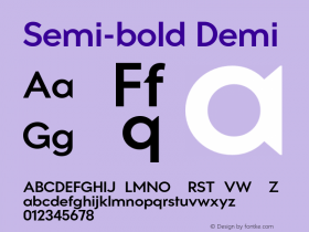
 Georgia and Verdana were born into a world of monitors that displayed binary bitmaps; pixels were either on or off; there was no anti-aliasing technology to improve screen imaging of type. One effect was to cause bold faces to be double the weight of the regulars, a big step by the standards of conventional type families. Screen displays are subtler now. The new Georgia and Verdana Pro series take advantage of the finer gradations of weight made possible by better rendering technologies in order to add light, semi-bold and black weights, none of which were possible 15 years ago. The new weights and the condensed series give graphic communicators a much wider range of typographic versatility, while remaining faithful in design to the originals.
After a long period when fonts optimized for legibility on screen were very limited in number, new technical models and new business models bring a far wider variety of Web fonts to the market. The design of Web sites will certainly benefit, and designers who have long been familiar with Verdana and Georgia in their original forms can take full advantage of the greater versatility of the Pro series, both on screen and in print.
Click here to learn more about Georgia Pro and Verdana Pro.

Allan Haley is Director of Words & Letters at Monotype Imaging. Here he is responsible for strategic planning and creative implementation of just about everything related to typeface designs.


 闽公网安备35010202000240号