


True Type of the Bauhaus


Even in Dessau, buildings are unwisely adorned with ITC Bauhaus, a child of the American '70s, not the German '20s.
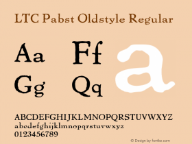
It might be disappointing to some, but most of what the Bauhaus printed in their early years was set not in geometric sans serifs but in art nouveau flavoured text faces. The initial Bauhaus manifest from 1919 (below), for example, usedOhioby Schriftguss AG (LTC Pabst Oldstyleis the most similar digital font available). Back then, one had to content oneself with the fonts a printer had in stock.

Typical early Bauhaus documents using serif typefaces.
Later, the typefaces used by the Bauhaus fit better within the ideas of the "New Typography": a clear, modern, industrial atmosphere achieved by anonymously designed, rather dark Grotesque faces stripped of all unnecessary decorative elements.
Breite Halbfette Grotesk in a 1912 Schelter & Giesecke specimen
A 1925 announcement by Herbert Bayer using Breite Halbfette Grotesk. FF Bau (2004) is a digital interpretation of this face.

This drawing by Herbert Bayer wasn't produced as a typeface.
A typeface in this vein often found in their later materials isBreite halbfette Groteskby Schelter & Giesecke, recently revived asFF Bauby Christian Schwartz. Others areVenusandIdeal Grotesk, later recycled inMonotype Grotesque.
But the typographic ideas of the Bauhaus, above all Herbert Bayer and Joost Schmidt, went further. The radical constructivist designs we now immediately connect with "Bauhaus", however, were only carried out in drafts — drawings and lettering — never in a typeface.
Paul Renner'sFuturawas clearly inspired by the concepts of the Bauhaus (see experimental letters) but came out no earlier than 1927. Then, however, it was accepted as the "type of our time".
The typefaceITC Bauhausis a design from 1975 by Ed Benguiat and Victor Caruso inspired by the ideas of Bayer, Schmidt et al, but it is not a revival of any Bauhaus design.
So, what typefaces should we choose to be more imaginative?
Typefaces like the ones used by the Bauhaus. For example:
FF BauVenusVonness (large family based on Venus)Monotype GrotesqueBasic CommercialGothic 726ARS Region
Geometric, constructivist typefaces based on the design ideas of the Bauhaus:
AlbersBayer UniversalJoostErbarFuturaDessauNeuzeit GroteskNobelSuper GroteskAvenirPTL SuperlaTwentieth Century
Also check out this FontList at FontShop.


 闽公网安备35010202000240号