


Bloomberg Businessweek


I experienced a range of emotions when I came across the first issues of Bloomberg Businessweek's redesign in early 2010: admiration, envy, and even a little anger. How dare creative director Richard Turley reinvent the venerable publication in such a Euro-perfect way, usingHelveticano less? And how gloriously Swiss (by way of London) it is: tight-but-not touching heads, buttery-smooth sidebar text, with the entire design informed (but not bound) by grids and rules.
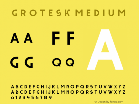
Except that it turns out that the type I was admiring wasn't really Helvetica, but a new digital version of its original incarnation,Neue Haas Grotesk. Type designer Christian Schwartz describes the project as a restoration, "bringing [Helvetica designer Max] Miedinger's original Neue Haas Grotesk back to life with as much fidelity to his original shapes and spacing as possible." The redrawn shapes, impeccable spacing, and revival of an alternate straight-legged 'R' position Neue Haas Grotesk as a contemporary sans serif, without a whiff of the nostalgia and irony that can saddle Helvetica.
Oh, and did I mention that the magazine's covers are consistently inventive and smart? It looks like the arrival of the latest issue of Bloomberg Businessweek will continue to be an emotional event.


 闽公网安备35010202000240号