


The Chop Shop


 If you were to design a traditional mom-and-pop butcher shop,Brothersis a natural place to start. The typeface, by legendary American sign painter John Downer, is endowed with his old-school craftsman values. Austin-based Ptarmak built the Chop Shop branding around Brothers, including its turn-of-the-century graphical elements, arrows, and panels.
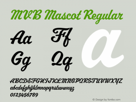
The bold and basicMVB Mascot, Metroscript, Machiarge and Fenway Park are better variations on the theme. Also used areUniversand the routine industrial sansTrade Gothic. They all work just fine, but it's the considerate identity package as a whole, and the way it's photographed, that wins me over.
In fact, the materials are so consistent and unencumbered by the usual client compromises that one wonders if there ever was a real client involved. (The chopshop.com URL on the posters go nowhere and Kansas City searches went dry.) Perhaps the business never got off the ground. If this was simply a show-off project, Ptarmak can be forgiven — it shows them off well. The mythical meat market made the blogosphere rounds all year long.


The imaginary identity campaign includes everything, down to the butchers' hats and aprons.

Click to enlarge.


 闽公网安备35010202000240号